I think I got this!
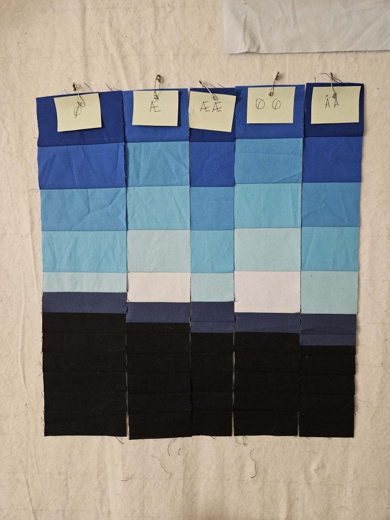
Over this past weekend, I had a full day to spend in the sewing room, so I started out working on a very overdue gift, but then had some time left over. I started sewing more of the double-wide strips, and I took out some of the lighter sky blues and replaced them with darker sky blues. Again, mistakes were made, decisions were reversed, math was done incorrectly, and the seam ripper got a workout.
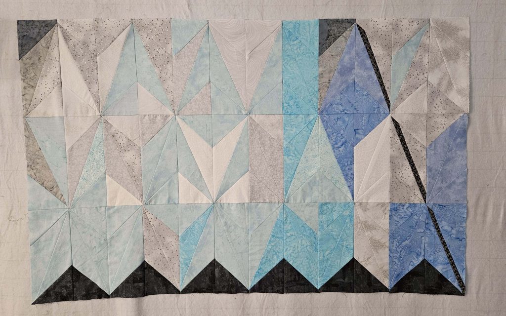
After sewing four more of the double-wide strips, I decided I needed to see how they looked cut in half and mirrored. Ignoring the fact that there are regularly things that don’t line up (‘cause I’m me), I’m actually really pleased with how this looks so far.
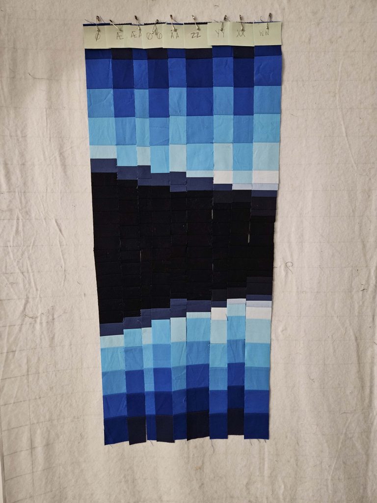
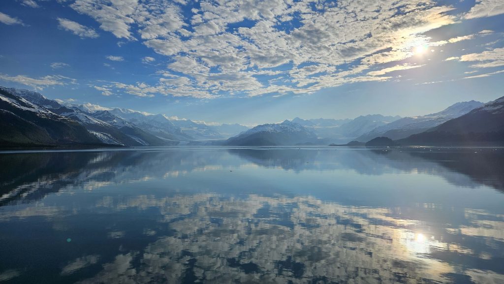
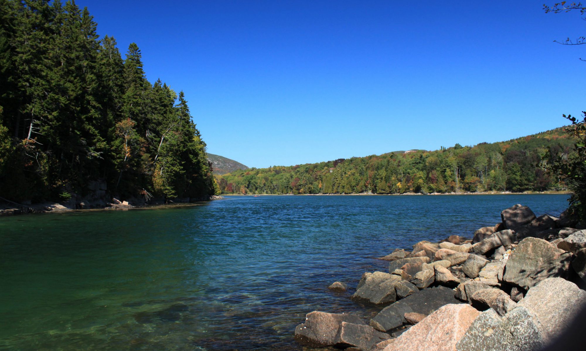
I feel like it’s actually starting to look like some mountains with a beautifully clear sky above, reflected in some very clear water. Which, frankly, is what the original picture is. There’s a lot more to the picture, though.
While I am happy that it’s starting to look like it’s supposed to, there are still some things that need to get resolved:
- The current plan is to do quilt-as-you-go quilting on this, with the strips being sewn together at the same time that they’re being sewn to the batting and backing. But I may have to throw that out, depending on what my solutions to these other issues are.
- What, exactly, will I do for a water line? I was going to completely ignore it, but the more I look at this, the more I think that it needs to be there. There is, in fact, a clear water line in the original image. SO…white or blue? How will it be created? (Current thinking on that is embroidery floss, but I’m still contemplating.)
- Same thoughts, only for snow. There is snow on top of almost all of the mountains. I would like to add that in somehow. The jury is completely out on that one…no idea how that’s going to go off, especially with the quilt-as-you-go method.
- Look closely at the rightmost two strips in the picture. The lightest mountain blue – which is the second-lightest of all of the mountain blues – almost disappears against the sky blues. If my solution for the snow does not solve that issue, I’m going to have to figure out how to set those off so that the lightest mountains don’t just blend into the lightest sky colors. Although…if you look at the original image, the furthest mountains do just sort of blend into the sky. Again, not quite sure what I’m going to do about that.
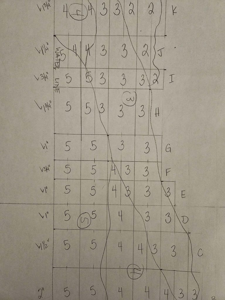
I have some work ahead of me – design choices as well as a LOT of sewing. I did cut and sort the remaining mountain blue pieces – I have 45 little piles of mountain blue strips pinned and labeled with the column letter, ready to go. I may try to get some of them sewn tonight, in fact.
I’ve completed nine of 54 strips. As my friend Joe said when I was telling him about it, “You’re almost 20% done!” Dude, that did not help.