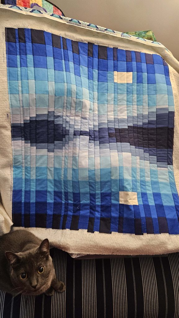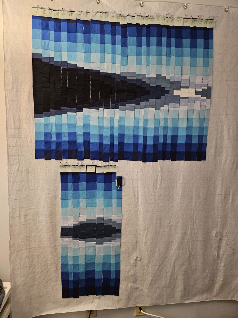
You’d think that sewing straight lines would be easy. You’d be wrong. I started working on the College Fjord quilt today, sewing more vertical strips onto the batting and backing. I realized after I’d worked for a while that somehow, I’d gone wonky. The top of what I’ve sewn together is now half an inch wider than the bottom. Still trying to figure out what exactly I want to do about that. I have three options: ignore it and move forward while not correcting for the discrepancy, try to correct for the difference as I move forward, or remove the strips back to where I’m pretty sure the wonkiness began and fix it. I was not up for making this decision today, so I put down the College Fjord quilt and started cutting up vertical strips for the Hus Ved Havet quilt.
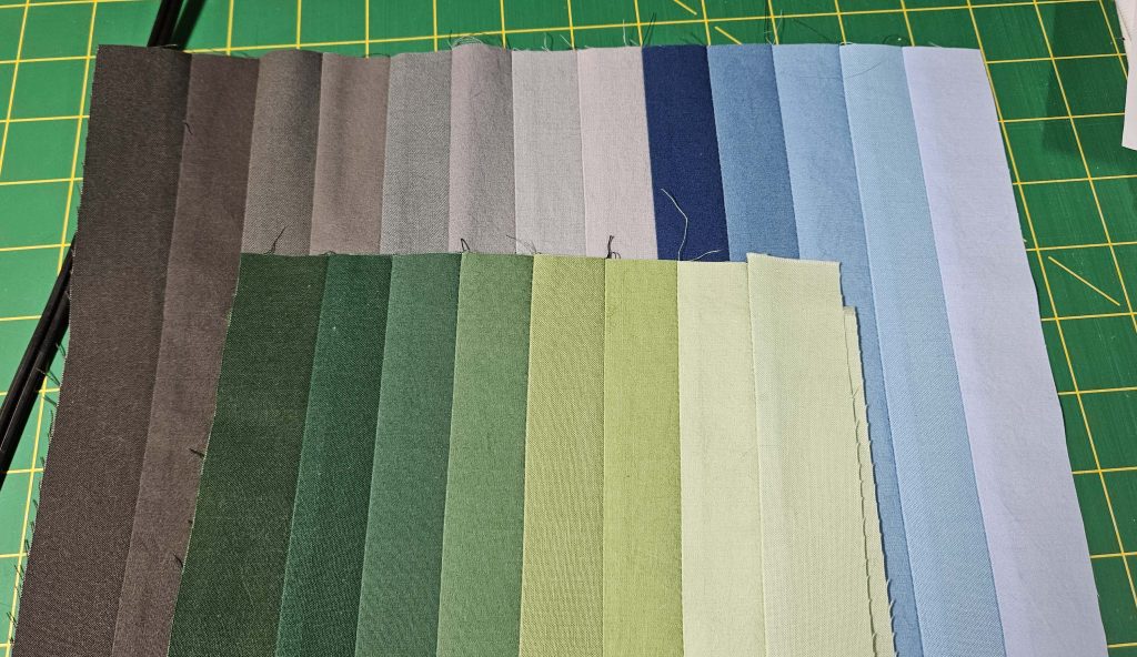
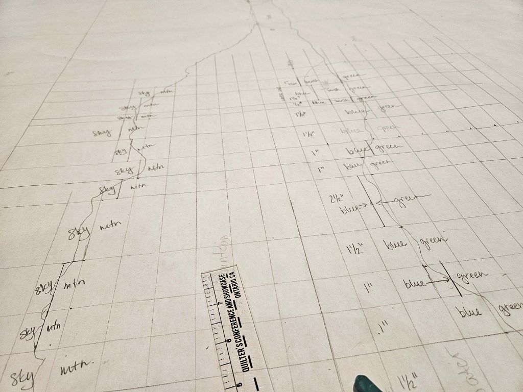
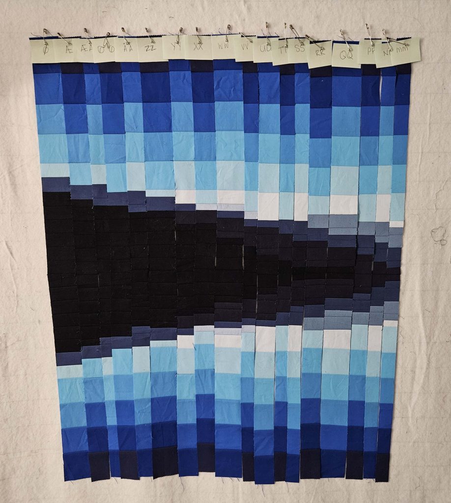
First note on this one: seam allowances take up more space than I think when I estimate in my head. I estimated that the mountains/water of this image would only need one strip of each color, but it’s going to be a stretch. I still have several vertical columns to cut, and I think it’s going to be OK, but I may need to cut out more small pieces.
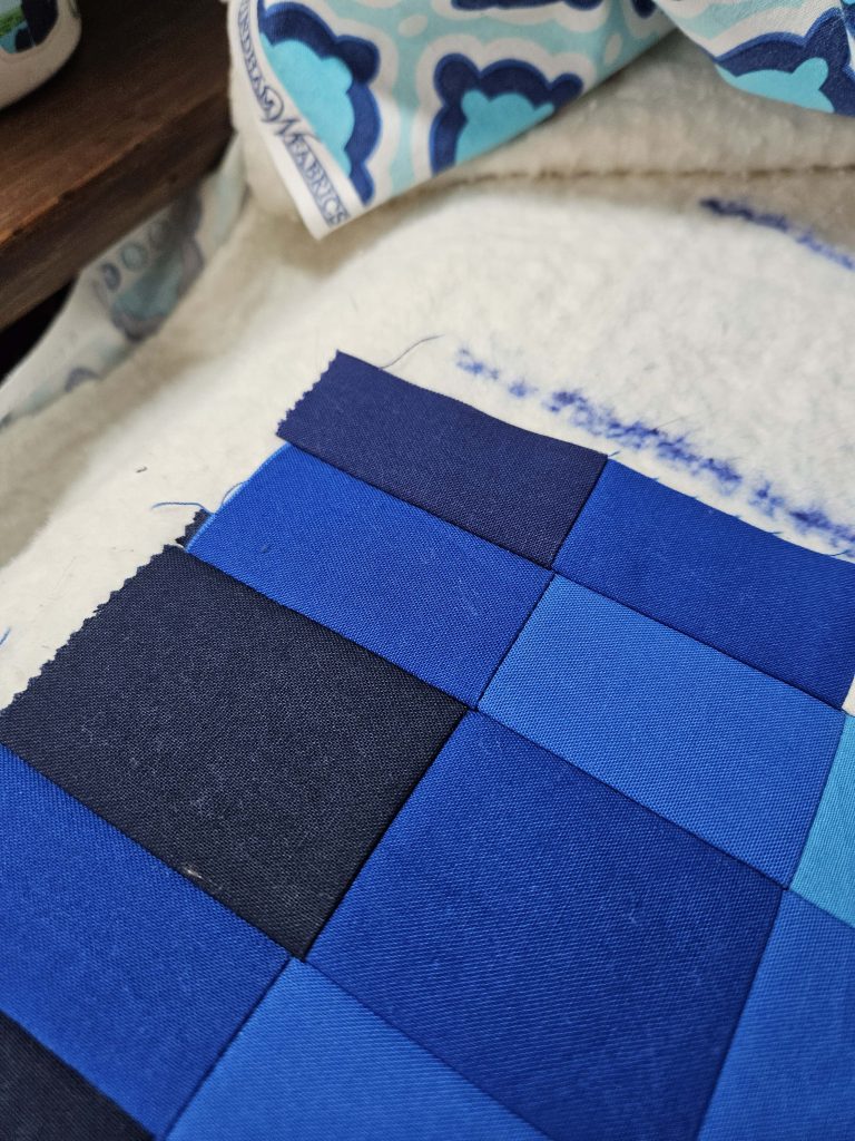
Second note: Apparently what I think is a quarter-inch seam allowance when I sew is more like a three-eighths seam allowance. Fortunately, I’m not following a pattern, and I am remarkably consistent when sewing, so the fact that my 1” blocks are actually more like ⅞” blocks is not a problem. I really need to mark a quarter inch on my sewing machine – just not until I’m done with this quilt.
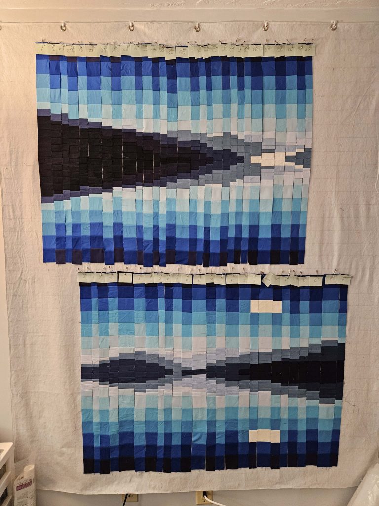
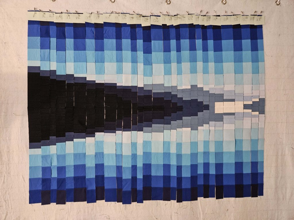
Based on what I see so far, I think this is going to be a successful quilt.
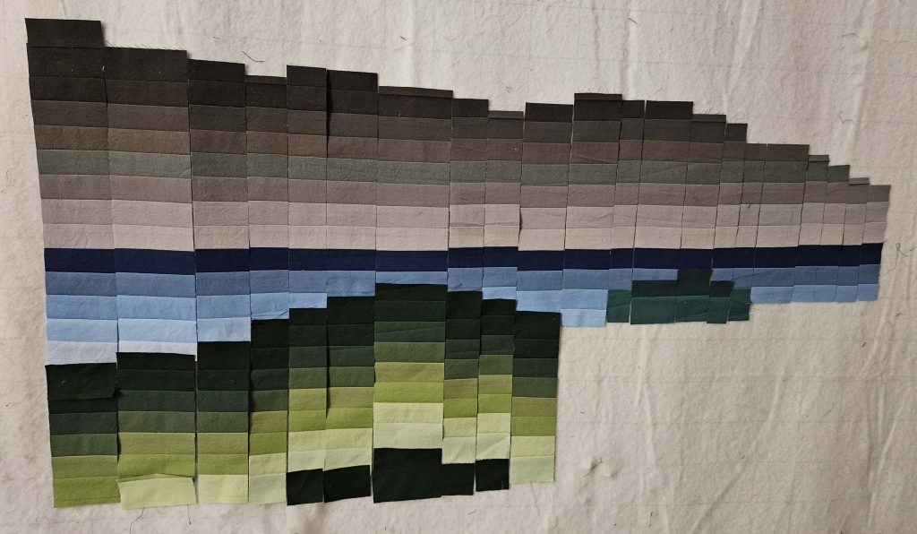
When I look at this on the design wall from across the room, I see the mountains and water and land in the foreground, which of course is what I’m going for. The jury is still out on the bush (the green bump on the right) versus the rest of the green vegetation in the foreground, but I need to see those side-by-side before I make any judgment. There are many bits of this that haven’t been sewn together yet, so some things look weird, but I was mostly cutting and not sewing today, so the sewing will have to wait until another day.
What’s interesting to me about working on this version of a bargello quilt is that it’s not a mirror image like the College Fjord quilt, but it’s also not like a regular bargello in that the colors don’t “move.” In a regular bargello quilt, each color moves up and down in the vertical to create movement. There’s almost none of that here. The greens at the bottom do it – the dark green is always the one that’s closest to the blue of the water, but that blue changes depending on how far away from the water line it is. The blues of the water and the grays of the mountain stay still.
When I was working on this quilt on paper at my guild’s Open Sew, I asked the other folks who were there what they thought of keeping the colors in the same place across the mountains and water. I wondered if there would be enough movement in the quilt to create interest. Someone said that I could create that movement with the quilting, and that was an excellent reminder for me. Since I’ve been using the quilt-as-you-go method with the College Fjord quilt and will be adding the buttons as additional “quilting,” I haven’t really needed to think about quilting that will be added later. The quilting on the College Fjord quilt is largely invisible. But using this color arrangement for the Hus Ved Havet quilt will give me an opportunity to do some surface quilting to add some visual interest where perhaps the colors don’t provide it naturally. It’ll be interesting to see how that plays out as I continue to build the quilt.
I still like the color choices, and I still like the way they blend together. I’m reserving some judgment for when I get the sky fabric cut up and added to the image – that will change things, I’m sure. There are a lot of decisions that will have to be made there, so I’m trying not to get too excited about this yet. But I’m happy with what I see so far!