Tag: quilting
-
Deadlines Are a Great Motivator
•
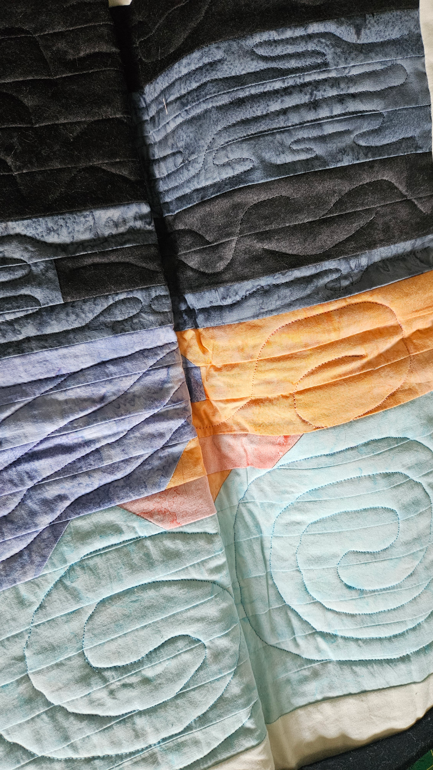
A few weeks ago, I said that I wanted to finish those four quilts before I speak to my guild in September. The College Fjord quilt is done. The Acadia sunrise quilt is now almost done as well. Let’s take a look at what I’ve done. There were two questions…
-
A Productive Weekend, Part 1
•
There aren’t many weekends that I can spend all or part of both days in my sewing room, but this was one of them. The entire day Saturday and some of the day Sunday were spent working on various items. With some bonus time on Friday evening, I was able…