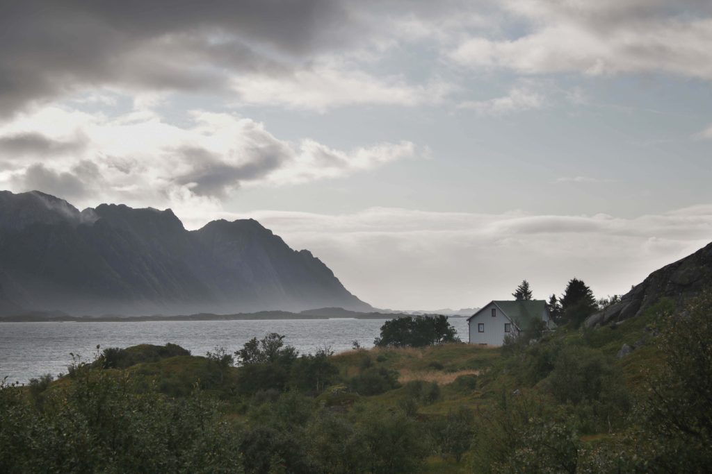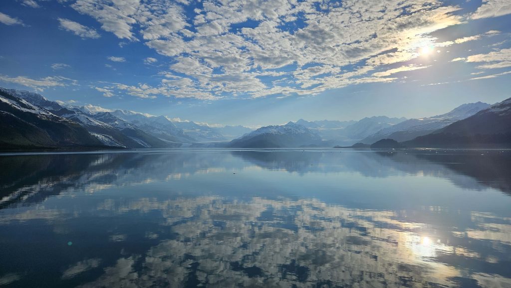
The Hus Ved Havet image (see previous post) will be divided into five sections, each with its own coloring and bargello method: the land in the foreground (greens/yellow-greens), the water (gray-blues), the mountain (grays), the sky (a blue-to-yellow ombre I originally bought for the College Fjord quilt but that didn’t fit there), and the clouds (creams/very light grays). There are three trees/bushes that will also be included, and the house, which I will claim artistic license on and make red like so many houses in Lofoten (where this was shot), will be appliqued.
In my head, the fabrics here are still solid. We’ll see how that goes, but that is currently the plan. If they’re not solid, they’ll be fabrics that read solid, but right now, I’m on the hunt for more solids. Currently planning an outing next weekend to two stores I know have a ton of them.
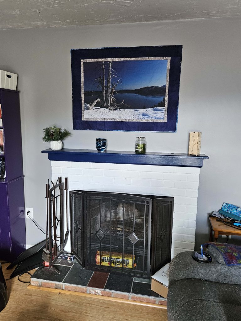
The College Fjord quilt has been fairly simple to put together because of the mirror imaging. This is very different. I can strip piece this (like how most bargello quilts are constructed), but each color group is going to have to be pieced separately and then all sewn together.
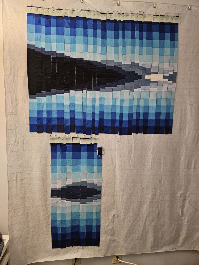
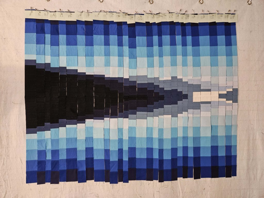
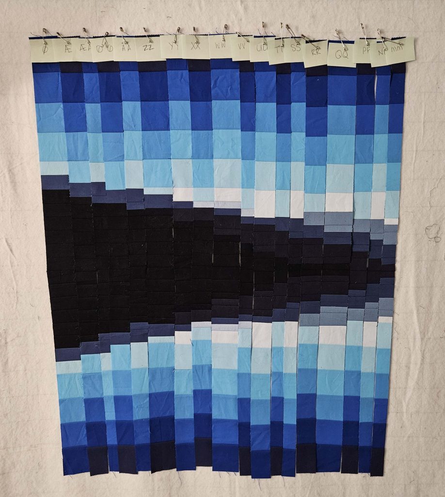
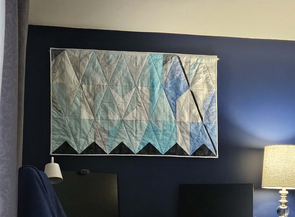
Like the College Fjord quilt, I started with the basic contours of the image sketched on a large piece of paper as the image was projected onto it. The vertical strips have to be the same from top to bottom, which so far has not been too much of a challenge but may prove problematic as I keep going (I got through about ⅓ of it yesterday). This is a sneak peek of what the planning looks like so far:
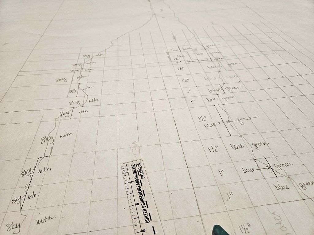
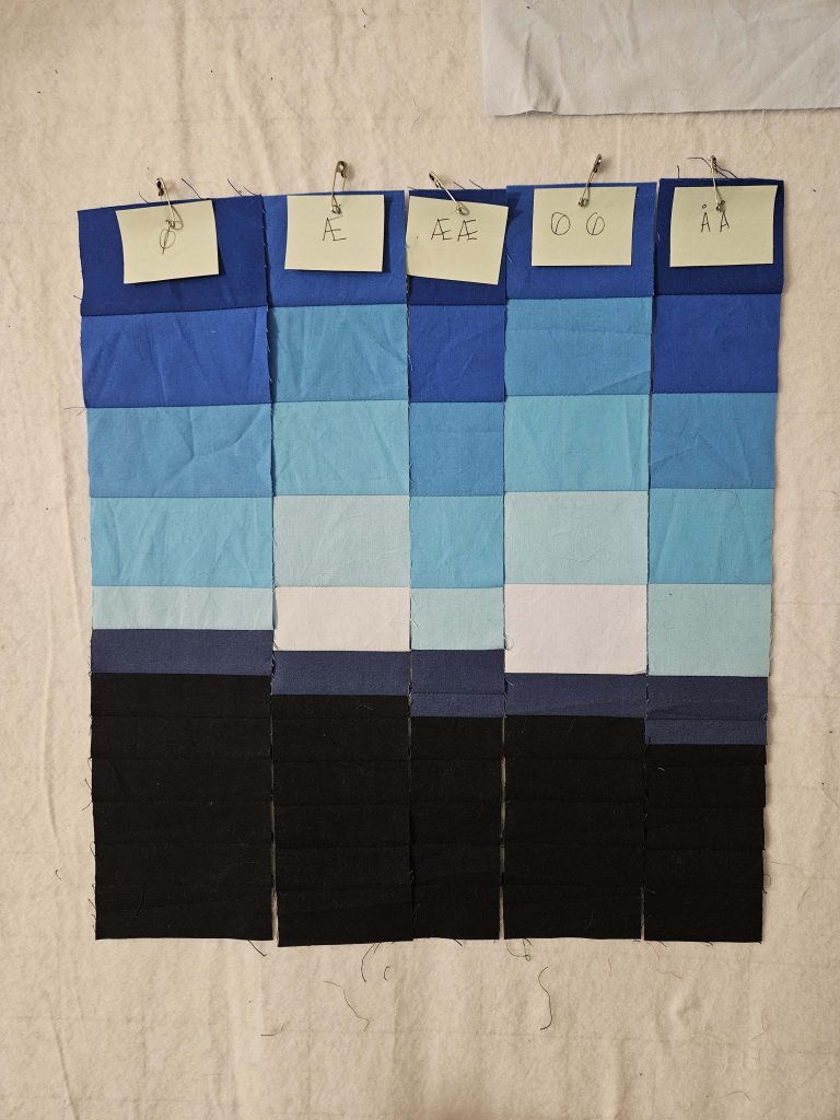
For reference, this is the center-ish of the image from top to bottom near the left edge. On the right, you can see measurements (1”, 1.5”, etc.) in blocks. The line to the left of those measurements is the water line. Anything to the left of that line in this image is the mountain moving to sky, and anything to the right of the water line is, well, water going into land. Adding the vertical lines (which in this image run left to right) is a bit of a challenge.
In the College Fjord quilt, I put vertical lines anywhere the contour of the mountain changed. But in this quilt, I also have to pay attention to the contour of the water against the land in the foreground, and if that changes, a vertical line needs to be added, too. Sometimes – in fact, surprisingly more often than not, they line up or at least can be fudged to line up. Other times they just don’t. It’s a lot to take into account, and I am 100% sure I will screw it up at some point. But so far, it’s working well.
One more design choice I made is that everything but the sky will be 1” strips; the sky will be 2” strips. This is exactly like the College Fjord quilt. I think it works really well that way – I like the contrast between the sky and the land. The one thing I haven’t decided yet is whether the clouds will be 1” or 2” strips. One inch might give me more flexibility, but two inches will blend better with the rest of the sky. I might have to do some experimenting before deciding that piece.
Still lots more to go on this quilt, but I’m really excited to see where this one goes. Let’s just hope I don’t need to create a spreadsheet this time!