When Bored…

Today, I took an unexpected sick day when I realized that I needed to deal with both a dentist appointment and what looks to be an infected tick bite (we don’t mess with Lyme disease up here in the northeast!). I feel fine, but I just needed to deal with these two appointments, and that was going to take a chunk out of my work day, so I just took it as a sick day. I was done dealing with both issues by about 2pm, so I decided to tackle the abstract iceberg foundation papers.

As a reminder, I planned this quilt out a couple of weeks ago. I have a foundation paper-pieced pattern that I’m going to use, and I copied all of the foundation papers for it and labeled them according to a diagram of the quilt back then, but stopped short of projecting the image onto the papers and deciding which piece would be what color. I tackled that part of the project today.

What I did:

I started by taking my felt design wall down and working with the bare wall. Fortunately, I have very light gray walls, so I didn’t have to cover them with white paper or anything like that to get true colors. I taped the foundation papers to the wall in the formation that they will be in once all of the fabric is sewn to them. So in the end, the papers covered the wall exactly the size of the final quilt. Then I turned on the projector and lined the image up with the papers on the wall. It didn’t have to be exact; this pattern’s pieces are pretty big, so a few millimeters here and there weren’t going to make a huge difference in the end.

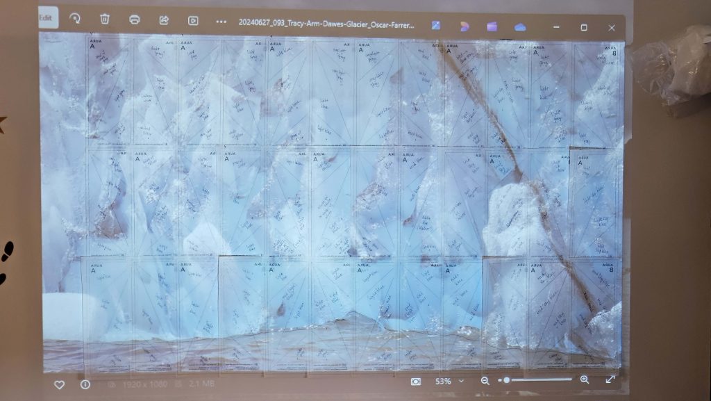
Once the image and the papers lined up, I labeled each foundation paper with the colors that the four fabric pieces would be, based on the image that was projected onto it. This proved to be far more challenging than I thought it would be. The fabrics I have for this quilt fall into four main colors – light ice blue-green, light gray (with or without silver on it), dark gray, and white on white. I found that I need more than that. I’ll use everything I have, but I also need a medium gray, a silver on white, and several blues I did not expect to need – a slightly darker ice blue-green, plus a light and medium sky blue (I did find a good medium sky blue in my stash). I was actually a little surprised to find that there was as much variation in the colors in the image as there is.

About halfway through labeling the pieces, after adding yet another color, I started to wonder whether or not I should have done this part first, before I even tried to go out and get a bunch of fabrics. It probably would have been a good choice. I have a much better idea of what the fabric requirements are for the whole quilt (me =/= a good estimator of size), so I might not have gotten nearly as much fabric as I did without really knowing what kind of quilt I was going to make. But I’m also not sure I would have come this far in thinking about the design of the quilt without some fabrics in hand. So I think it could have gone either way. Could I have done this without having any of the fabrics? Sure. But I think I now have a different mind’s-eye image of this photograph, so if I had waited to get fabrics until I had finished what I did today, I think I would be making very different fabric choices.

I imagine that this will be a technique I use moving forward with other images and published patterns. It might be a little difficult with a pattern that isn’t foundation paper-pieced; I think I might have to take a look for some larger pieces of gridded white paper so that I can map out what a pattern might look like if the pattern doesn’t already come with a coloring page to experiment with different color combinations (both of the patterns I’ve used so far for the Horseshoe Canyon and abstract iceberg quilts have had coloring pages).

A couple of things I learned today:

  • I am out of Scotch tape. I’m not 100% sure when the last time was that I was out of Scotch tape, but it has to have been many, many years ago. I could have sworn I have more tape somewhere, but I couldn’t find it. I used the last piece on the last foundation paper.
  • Tape the pieces to the wall, but not to each other. All of the tape has to be peeled off afterward, and it’s easier to peel one piece of tape off of one piece of paper, not multiple pieces of tape off of each piece of paper.
  • Draw the contours of the image onto the foundation papers, even if you won’t use them in the final quilt. I drew the line between the bottom of the iceberg and the water onto the papers. I probably won’t use that info when piecing, but it will be helpful to have if I have questions or want to make a different choice if the water ends up looking weird.
  • Take pictures before you take everything down! The pictures should include closeups of every foundation paper with the image projected onto it, plus the whole image with the papers “behind” it. I didn’t want to tape all of those papers to the wall a second time, so I made sure to document it ALL.

All in all, I’m a big fan of this process. The jury is still out on whether the result will live up to my expectations.

Fabric Challenges

A few blog posts ago, I mentioned that I’ve had to get over my dislike of batiks. Let’s look at that a little.

Batiks are…not my style. Generally, at least. Up to this point in my quilting journey, I have used them very little. I tend to use bright colors and crisp patterns that appeal to me, and batiks always seem to be…I don’t know. Sloppy is a word I might use, but it has negative connotations that I don’t mean. Irregular might be a better word. Out of focus, to use a term from photography. The lines aren’t sharp – they tend to blend a little more than I’d like. Put batiks next to the clearly defined patterns that I normally choose, and they seem out of place. Like a watercolor painting contrasted with a nice sharp photograph. Each has their place, but you probably aren’t going to mix them into the same piece of art. Up until recently, I’ve tended to gravitate towards the photographs rather than the watercolors. Which, you know, makes sense…since I’m a photographer.

But the very qualities that make batiks ill-suited to fit with the fabrics I normally choose are exactly what makes them excellent for these projects. Nature is irregular and amorphous and…sloppy. Nature doesn’t fit neatly into a box. Batiks are perfect for attempting to recreate nature through fabric. (Which is sort of ironic – using the fabric version of watercolors to recreate photographs…but I digress.)

With some exceptions, batik fabrics read as solid – or, at the very least, variations on one color – from across a room. But there is random texture to them that mimics nature nicely, in a way that a perfectly designed, repeatable pattern can’t ever do. And so I have been going directly to the batiks to source many of the fabrics for these quilts. And that is a sentence I never thought I’d write.

That’s not to say that I have not – and won’t in the future – use fabrics elsewhere in the store for some of these quilts. Several of the fabrics I’ve picked out for the abstract iceberg quilt came from, of all places, the section of Christmas fabrics. (Hey – if you’re looking for whites and grays with silver, the Christmas section is a great place to start. You certainly won’t find them in the Halloween fabrics!) The key here is keeping the photograph in mind, but not closing yourself off to the possibilities that might lie in sections of the quilt store you haven’t looked at yet. I almost stopped after looking through the batiks for fabrics for the abstract iceberg. I’m glad I didn’t.

One word of caution: when you are looking for fabric for a quilt, take everything with you that you think you might use in it. Everything. At least a small sample of each. (This is just a word to the wise for any quilt, but particularly so for these.) For the Horseshoe Canyon quilt, I bought several pieces of orange fabric that, in my mind’s eye, I was sure would be perfect to go with the oranges I already had. And in every case where I didn’t have samples of the fabric I already had, I was 100% wrong. Was my mind’s eye wrong? Was the lighting weird? Who knows? But now I have these pieces of orange batik fabric that I don’t know what to do with (because orange isn’t normally my style AT ALL, and we’ve already talked about my relationship with batiks). So…yeah. Take what you’ve already purchased with you when sourcing additional fabrics, or be prepared to put the extras into your stash ‘cause you screwed up.

Choosing Fabrics

If you’re not going to print the photograph onto fabric and play with it that way, you’re probably going to need to find some fabrics that in some way mimic what you’re trying to capture of the photo. Colors. Shapes. Mood. All of those can be recreated in some way using the fabrics you can find in a quilt store.

When I was looking at fabrics for the Horseshoe Canyon quilt, I was mostly trying to capture color, but I wasn’t necessarily trying to be 100% faithful to the original image. There was no way that anyone could have gotten me to produce a quilt where all of that orange was replaced by the rust colors in the original image. Nope. That’s not how I see that image in my mind’s eye, and I knew the rust colors of the canyon weren’t going to translate well into a quilt. In retrospect, would I have incorporated a few rusts here and there among all of those orange strips of fabric? Maybe. I don’t know what that might have looked like. But I might have entertained the thought, at least, instead of simply blazing ahead with all of those awfully bright oranges. I wanted the quilt to be saturated colors, not muted ones, and the orange truly came through for me in that respect. I also liked the combination of bright blue and orange with a deep, dark green, and in that sense the final quilt is a success.

Look back at the unsuccessful (read: BOOOORING) version of that image from Norway that made me rethink all of the ideas I had to create fabric versions of some of my favorite photos. For that attempt, I was trying much harder to be faithful to the original coloring of the image, and look where it got me. It got me a snoozefest. Granted, I don’t necessarily think choosing different colors might have worked better, but certainly going with the original coloring wasn’t as successful as I had thought it might be.

I’m currently choosing fabrics for two of the three quilts I’m working on. (The third is thread painting, so no extra fabrics until I add a border, and I won’t even think about border fabric until the inside image is complete.) For the Tracy Arm iceberg one, I’m trying as much as possible to maintain the feel of the original photograph, if not the exact original colors. The goal for that quilt is to emphasize the brilliant blue green of the iceberg, which the photo does nicely. But I have a chance to keep the feeling of the photo yet enhance the contrast between the rest of the image and the iceberg. I have selected some fabrics from my stash, but I’m also looking for others. And I’m debating what to do about the snow on the mountains in the original image. I’m just not going to find that in a fabric. So – do I leave it out? Do I insert it with thread (not fabric) at the end? Do I attempt to find a good snow fabric that might suffice in small quantities? I might try all three and see which one I like best.

For the abstract iceberg image, I’m mostly going for the colors. Those are what drew me to the photo when it was being displayed on the big screen on the ship, and I think that image might not be as good if it were just plain white ice, for example. The blue green of the ice is compelling to me (hence my wanting to do two different quilts with that color as the emphasis). The challenge here is going to be finding the right blue green, with enough variation and quantity that it will fill out the quilt nicely.