Tag: Alaska
-
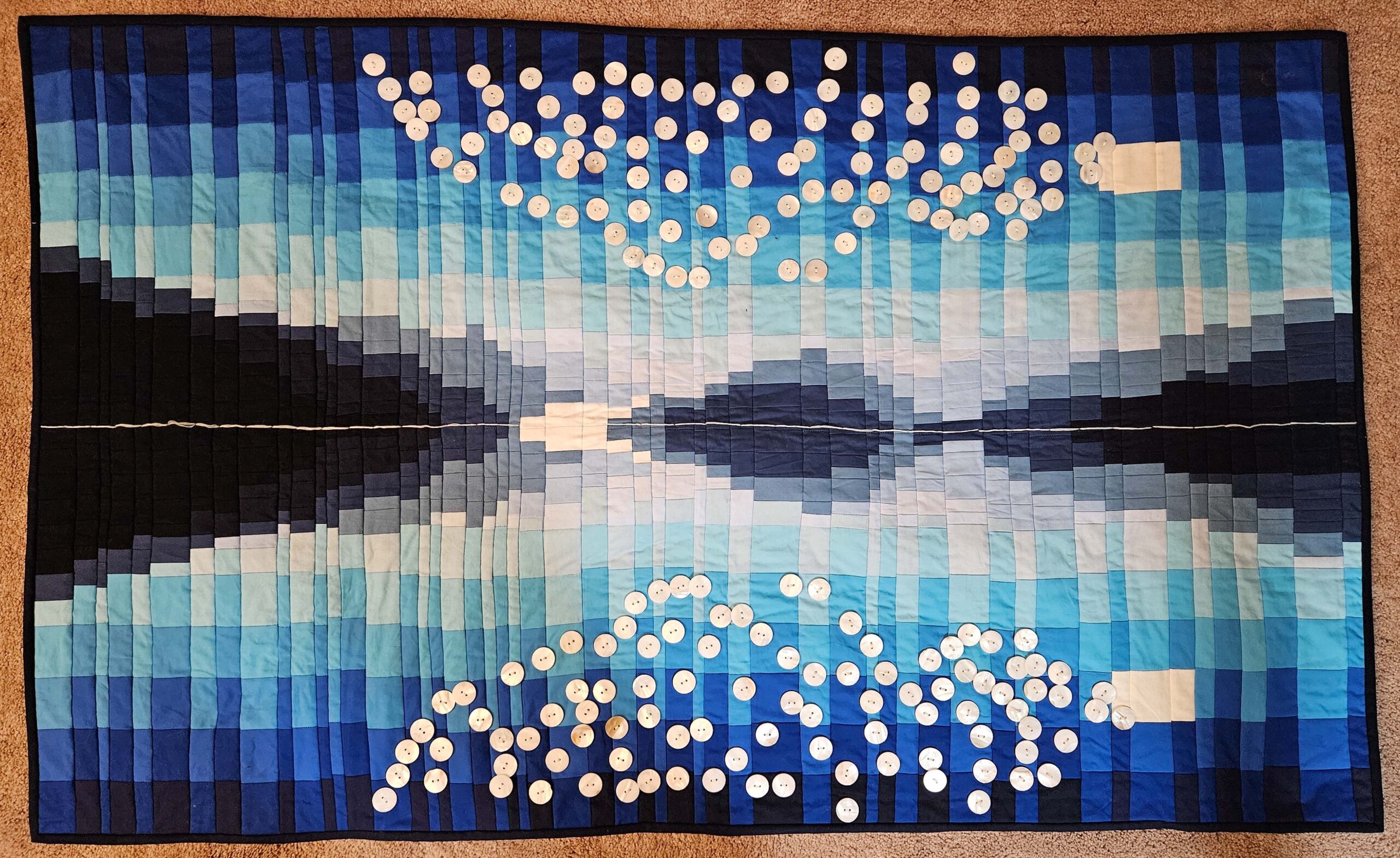
College Fjord is Done!
•
Sewing buttons on with a machine is SO much easier and less painful! I really wanted to get it done before a year had passed since I took the photo (June 23, 2024), and I just squeaked it under the wire. Just as a reminder, here’s the original image: And…
-
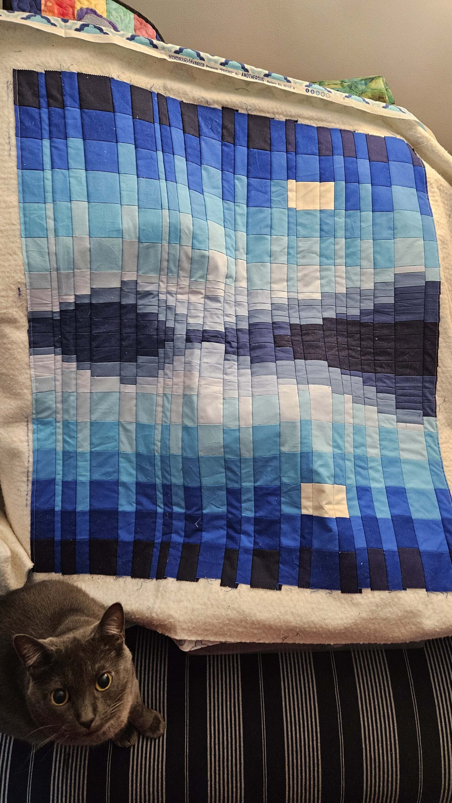
Getting Closer
•
The College Fjord quilt top is finished! Well, the quilt-as-you-go portion is done, and it mostly came out well. It’s only slightly wonky, and while there are some things that are clearly not “right,” the overall effect is exactly what I was going for. I will save the final reveal…