This is my first attempt at a quilt based on a picture as part of this new project. The image I chose is from a 2019 visit to Arizona and the Grand Canyon. My friend Nicole and I took a day trip to Antelope Canyon and stopped at an overlook over Horseshoe Canyon on the way back. This is an example of a picture I like that didn’t have a particular focus element in it that would make it interesting printed out on fabric. It also wouldn’t have lent itself well to the applique method I learned, so I decided this would be an abstract version.
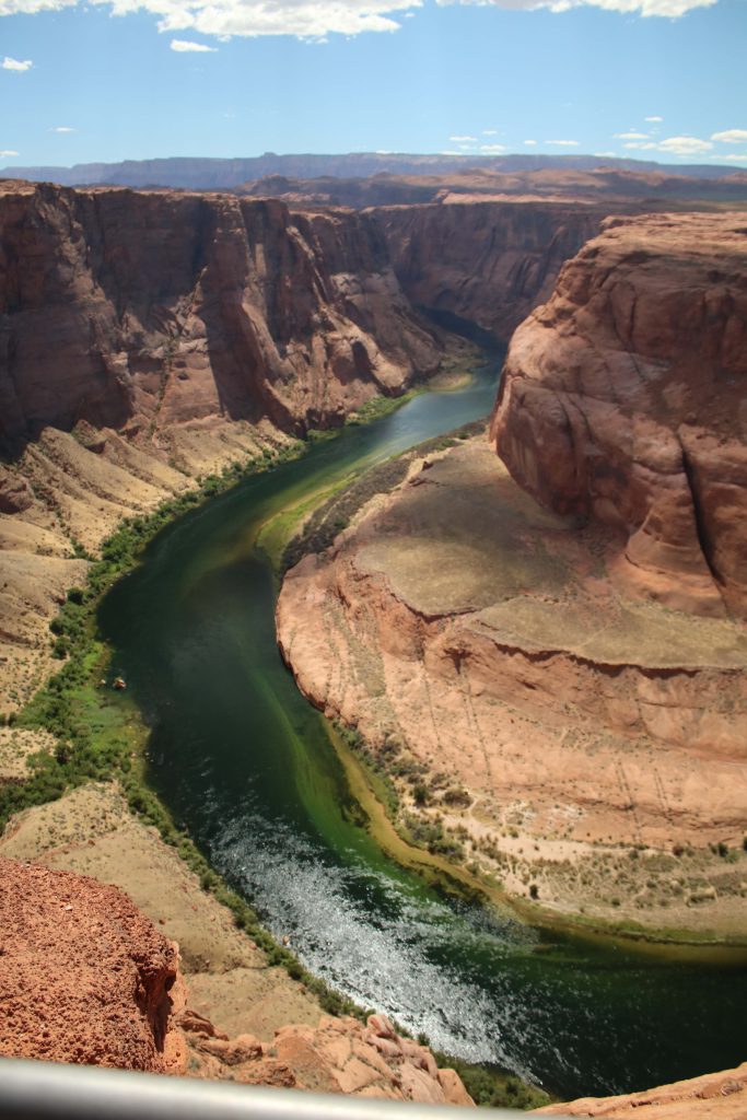
I like this photo because it has movement, and I think the colors go well together. When I was looking for the fabrics, though, I could not bring myself to use the rust color of the canyon itself. The blue of the sky and the dark green of the river – those are totally in my wheelhouse, and I was actually able to use some fabrics I already owned (always a bonus). But I am not a fan of brown, and I wanted the deep green of the river to pop out a little more than it did in the original photo. So I decided to use a brighter orange instead. I liked the combination of dark green, bright blue, and orange – somehow, they just fit together (in my head, at least).
I also found a published pattern called Leading Edge by Canuck Quilter Designs that mimicked the shape of the river as it flowed through the canyon in my image. I ended up changing the order of the rows in the design (as you’ll see), but basically keeping the structure of each row the same. Finding the published pattern that just happened to mimic the image that I was trying ro recreate was a fluke of nature. I’m still not quite sure how that happened as it did. I’m glad it did – I would not have known how to approach recreating that image without the pattern – but I also know that I’m not going to be able to do that with all – or perhaps even any – of my quilts going forward. But this was an excellent way to dip my toes into creating an abstract version of this image. And I’m pleased with the result.
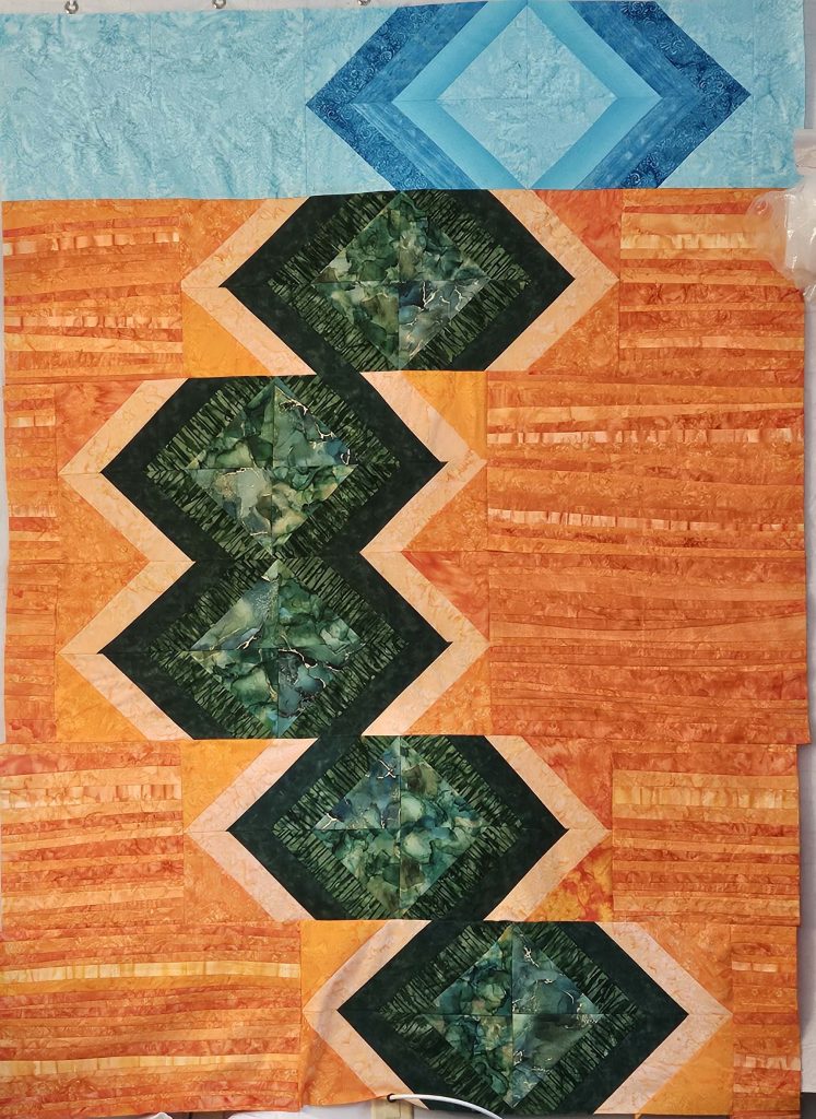
I learned a lot in this process. I leaned into the orange perhaps a little harder than I should have, and in retrospect, I might have sprinkled some of the rust colors in between the orange stripes for variation. But I am unused to working with orange (give me a blue, green, purple, or even red any day of the week, but oranges, yellows, and browns tend not to find any sort of place in my work), so the end result – to my eyes, a wall of bright orange – sort of hit me in the face as I was putting it up on my design wall right at the very end. Could I have stopped and adding a few rust stripes in? Sure. Was I going to do so? Nope. (See my early posts on how it’s better done than perfect.) I chalked it up as a learning experience, and I’m moving on.
I do like the final result. It needs a border, and I haven’t figured out what that might be yet, and I am yet hoping that the border will bring it all together. Because of the orange stripes, there’s a ton of texture already in the quilt, so the quilting is likely to be stitch-in-the-ditch along some (not all) of the orange pieces, plus some texture in the greens and blues. I’ll post a picture when it’s all done, too.