Category: Planning the Quilts
-
So…Now What?
•
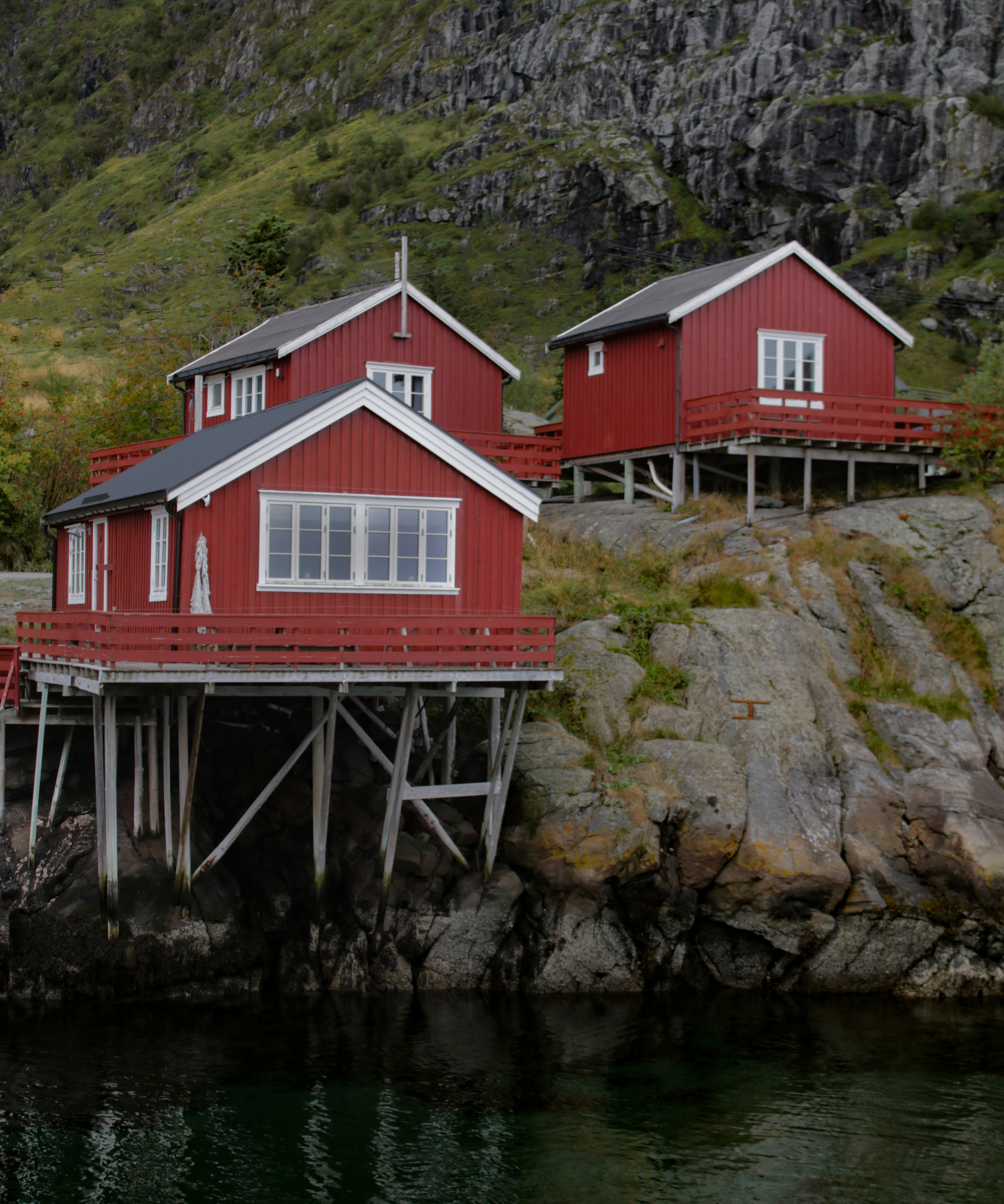
I’ve been contemplating where to go from here and gathering fabrics for three different quilts that I think will be good to work on next, and I started one of them over this past weekend. Here’s an overview: Å i Lofoten This tiny village on the Lofoten Islands is named…
-
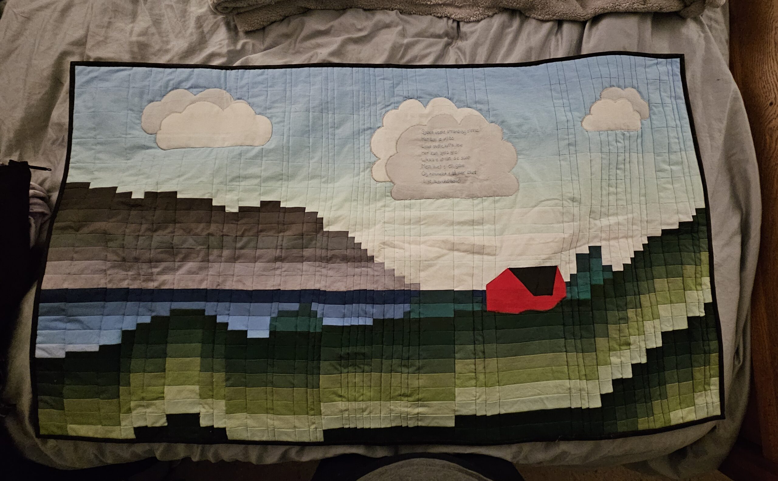
Simple Yet Evocative
•
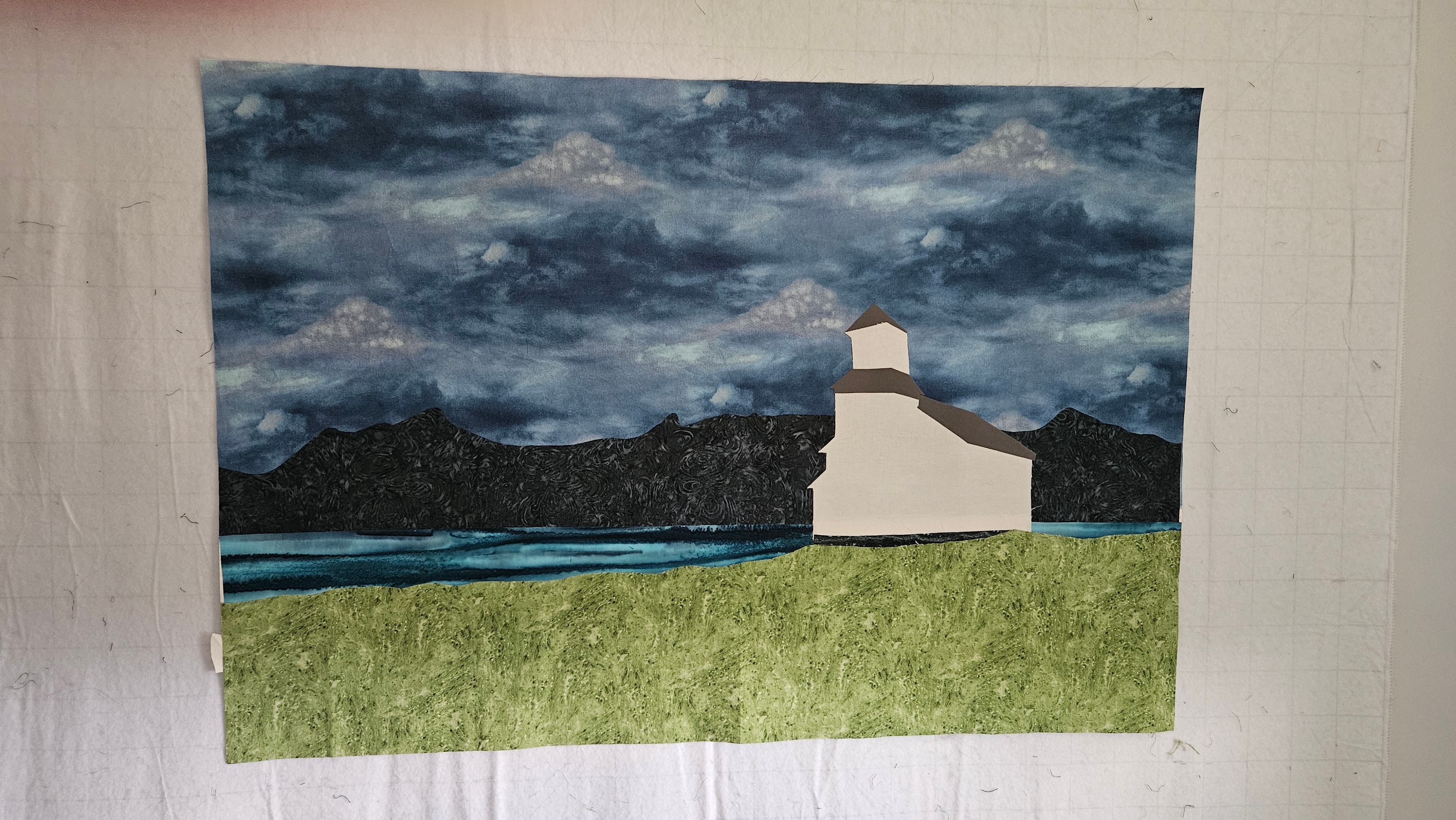
A while back, I said I was still debating the sky fabric for the Gimsøy quilt. I had a couple of options, but the one I was leaning strongly toward had a hole cut out of one corner and wasn’t going to be big enough. I knew where I’d gotten…
-
On to the Next Quilt
•
I received the fabric printouts of the two pictures that I wanted to use like I used the image in the Tracy Arm quilt, and now I’m rethinking my strategy on at least one of them. Come along on my thinking process journey. This is the original image: It’s the…
-
The Border Debate Continues
•
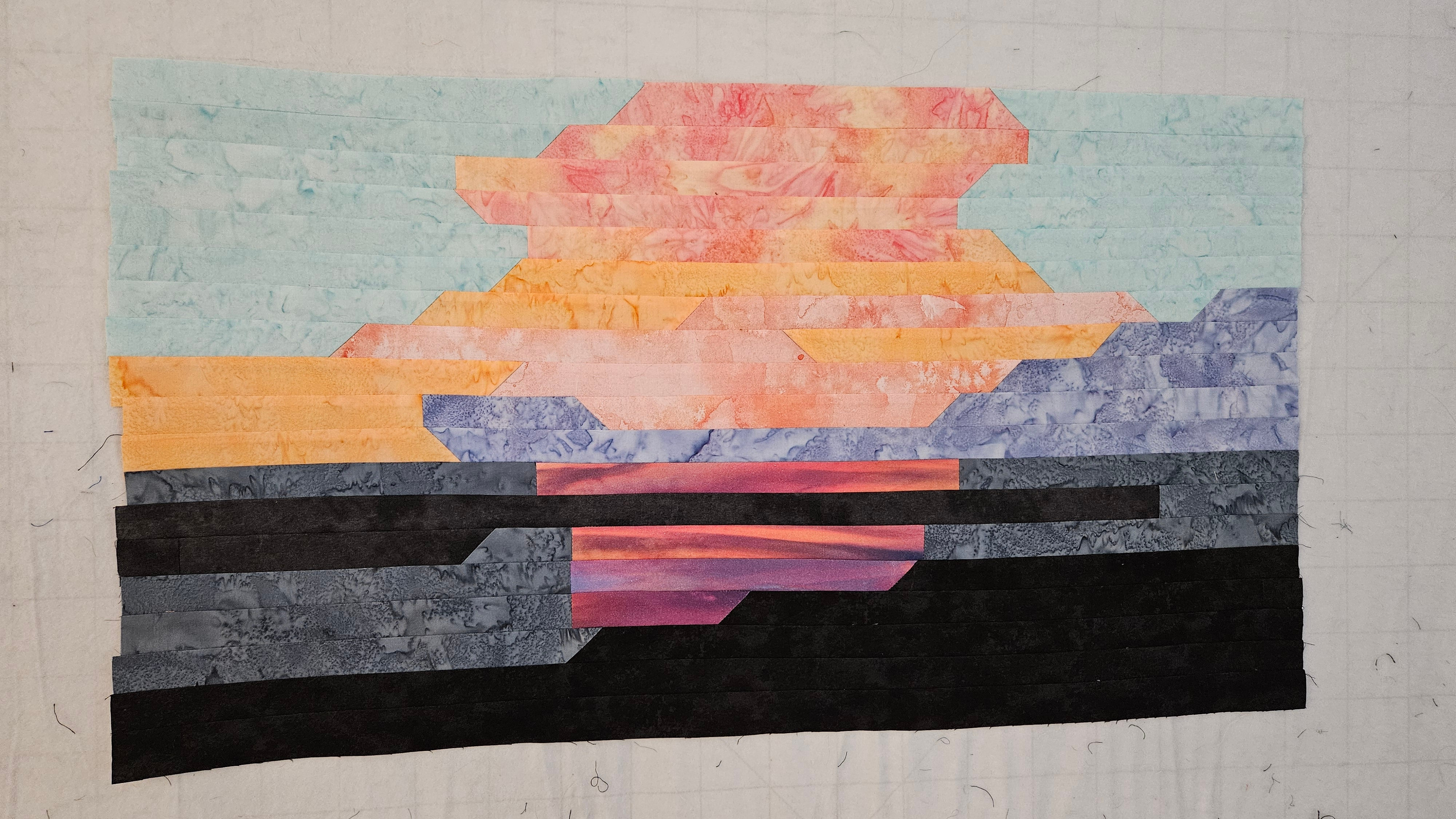
The debate about borders continues. This time, it’s the Acadia sunrise quilt. This is where it stands now: I finished sewing the horizontal strips together several days ago, and I put it back up on the design wall and just could not figure out what to do next in terms…
-
Catching Up
•
It’s been a while. In late February, I discovered that there was an issue with my website’s hosting service (although I didn’t know exactly what the issue was at the time). It took several months to resolve, and I have had to recreate my entire website over the last week.…
-

So, What’s Next?
•
A key component of being motivated to finish things, for me, is being able to look forward to the next project. I have to finish things before I can move on, of course, but the planning for the next idea can take place while the actual construction is taking place…