A key component of being motivated to finish things, for me, is being able to look forward to the next project. I have to finish things before I can move on, of course, but the planning for the next idea can take place while the actual construction is taking place on the current project. Sort of like building houses – you’ve got your architect finishing plans, and you’ve started to get the permits in place, and you’re ordering supplies for the next house you’ll be working on while you’re finishing up the final details of the one you’re building now. If you don’t do this, there’s lag time. Lag time is bad.
In the case of the projects I’m working on now, two are near completion. The Oregon waterfall quilt is all put together and just needs finishing touches to the top. I’m not sure what’s going to happen once the top is done – I’ll finish it to get some experience with the sewn details that I’m working on, but I’m not sure I like it enough to make it into a quilt. We’ll see once it’s done. Maybe it’ll get framed instead.
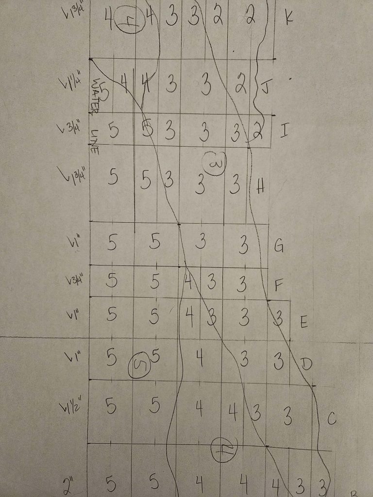
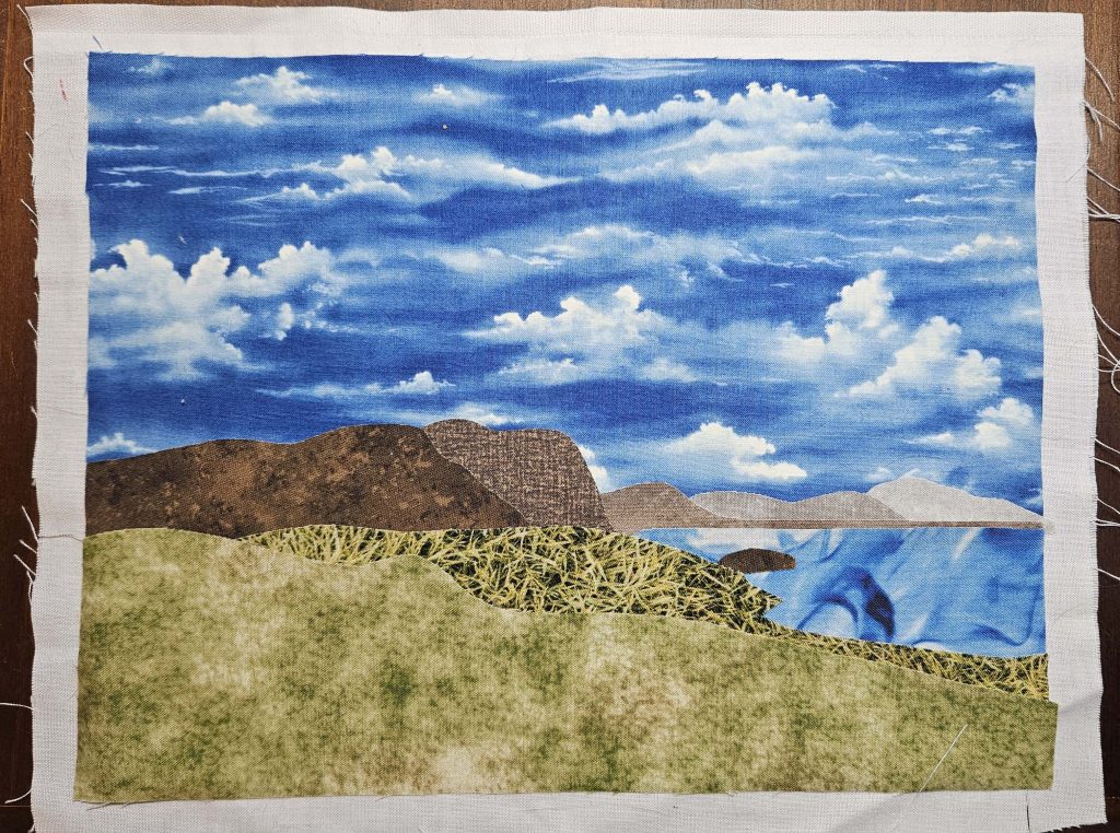
The College Fjord quilt is, honestly, a good weekend of work away from being finished. I have ten or twelve vertical strips left to sew on, and then the quilting is done because I’ve been quilting as I go. I’ll need to add the buttons and the binding. That’s it.
The Hus Ved Havet quilt is the one that isn’t nearly done yet. There’s still a ton of work left to be done there, and that’s OK – I can (and need to) work on multiple projects at once.
So…where do I go next? One thing that I’ve been wanting to figure out is a sunrise or sunset. I have taken many, many pictures of sunrises and sunsets over the years, many of which are very nice (if I do say so myself). One of the ideas I’ve been mulling over in my head is the idea of going horizontal this time instead of vertical. Horizontal stripes. The Hus Ved Havet quilt is a little like that – the mountains in the distance and the water are both composed of horizontal stripes that have been broken up by the bargello construction. But this time, I’m thinking of vertical stripes that have not been cut up into smaller pieces. Think jelly roll quilt, only 1” strips instead of 2” strips. (I’m going smaller this time.)
If you’ve ever done a jelly roll quilt, it’s basic construction is “sew the strips end-to-end, then cut them into lengths of a certain measurement (say, 50”), then sew them side-to-side randomly.” The idea I’m mulling in my head is similar: sew long strips together end-to-end, then sew them side-to-side. It’s not unlike the bargello construction in reverse, only there are no small pieces going in the horizontal direction, only long strips. Let me explain using one of the images I’m thinking about using.
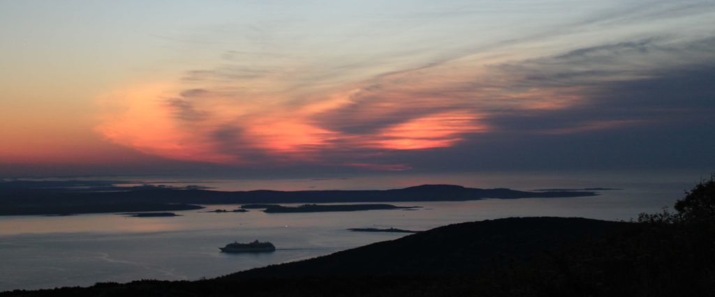
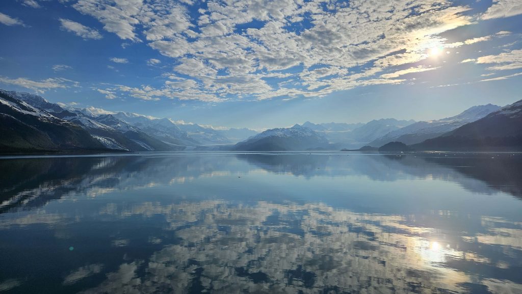
This photo has been cropped to take out wide swaths of sky at the top and black land at the bottom. I took it in Acadia National Park, from the top of Cadillac Mountain at sunrise. There’s land, there’s water, and there’s sky with clouds. And there are colors.
Imagine this image divided into twenty horizontal stripes. Those stripes aren’t very wide in the image, but they’d be 1” wide in the final quilt. Let’s look at the stripe just above the water line. Most of that stripe is going to be a purpley-gray color, but for a few inches in the middle, that stripe will be orange. The purpley-grays on the left and right will be long pieces of whatever fabric I find to represent that color. The orange in the middle will be a small piece. So that one strip of the image will be made of three pieces of fabric. (Note: This construction sounds heavenly after sewing a bargello. Two seams instead of forty!) The bottom strip of the quilt would be one long strip of whatever I find for black.
I’m still trying to decide if this is the way I want to go, but I’m leaning in this direction for a couple of reasons. First, it’s different from what I’ve been working on. The structure is basically the opposite of what I’ve been working on for a while, so it intrigues me. Second, there are different colors. The blues and greens and grays and browns I’ve been working with for a while are fine, and they’re completely appropriate for the images I’ve picked so far, but working with pink and orange and purple sounds lovely. I also want to redeem myself a little bit after all of the oranges I used in the Horseshoe Canyon quilt, and I want to prove to myself that I can use orange responsibly this time.
I’ve got a little while until I’ll feel like I’m ready to take on another quilt, so this can simmer for a little bit.