WordPress database error: [The MySQL server is running with the --read-only option so it cannot execute this statement] DELETE FROM `wp_options` WHERE `option_name` = '_site_transient_wp_theme_files_patterns-890b82f054d0977074a5148474f89490'
WordPress database error: [The MySQL server is running with the --read-only option so it cannot execute this statement] DELETE FROM `wp_options` WHERE `option_name` = '_site_transient_timeout_wp_theme_files_patterns-890b82f054d0977074a5148474f89490'
WordPress database error: [The MySQL server is running with the --read-only option so it cannot execute this statement] INSERT INTO `wp_options` (`option_name`, `option_value`, `autoload`) VALUES ('_site_transient_timeout_wp_theme_files_patterns-890b82f054d0977074a5148474f89490', '1740326727', 'off') ON DUPLICATE KEY UPDATE `option_name` = VALUES(`option_name`), `option_value` = VALUES(`option_value`), `autoload` = VALUES(`autoload`)
WordPress database error: [The MySQL server is running with the --read-only option so it cannot execute this statement] INSERT INTO `wp_options` (`option_name`, `option_value`, `autoload`) VALUES ('_site_transient_wp_theme_files_patterns-890b82f054d0977074a5148474f89490', 'a:2:{s:7:\"version\";s:3:\"3.8\";s:8:\"patterns\";a:0:{}}', 'off') ON DUPLICATE KEY UPDATE `option_name` = VALUES(`option_name`), `option_value` = VALUES(`option_value`), `autoload` = VALUES(`autoload`)
WordPress database error: [The MySQL server is running with the --read-only option so it cannot execute this statement] UPDATE `wp_options` SET `option_value` = '1740324927.5988159179687500000000' WHERE `option_name` = '_transient_doing_cron'
When I originally decided to attempt an image using a bargello concept, I had two images in mind that I wanted this to work with. One was obviously the College Fjord quilt, which is on pause briefly until I have the right color again but is clearly going to be a gorgeous quilt in the end. I’m SO excited about that quilt!
But as I was planning the College Fjord quilt, there was some trepidation that it wouldn’t work for that one, and if it didn’t work there, I wasn’t going to even attempt a second one. Bargello quilts are just too detailed and difficult to put a lot of work into if it’s not going to be successful. So I said early on that I was going to attempt the College Fjord one, and if that worked, I’d attempt a second one.
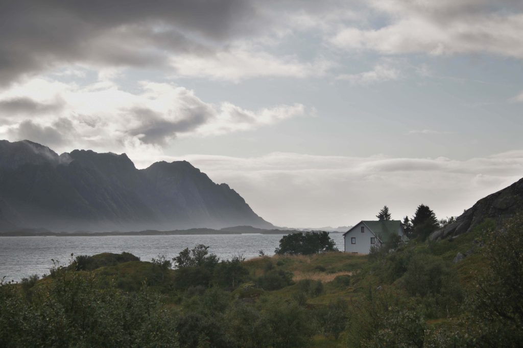
Now that I have proof of concept, it’s time to start work on the second bargello. I am also really excited about this one, and now that I’ve looked at it a little bit, I’m REALLY glad I started with the College Fjord one. The College Fjord quilt is symmetrical – it’s a mirror image. The second one is not, which means it has its own special issues. Here’s the original image:
This image reminds me of a song, “Hus Ved Havet” (House by the Sea) by Halvdan Sivertsen, one of my favorite Norwegian musical artists. I have an early songbook of his that includes many images to go along with the music, and this image reminds me of the pencil drawing that is in that songbook to accompany this song. I’ve always wanted to do my own rendition of that idea – a house by the sea. So here we go.
I ended up ordering another one of the jelly rolls. Even though I’m pretty sure I had the name of the color I needed, the color on the screen and the color of the fabric aren’t always the same, so I couldn’t be 100% sure. I also couldn’t find the color I thought I needed at any of my local shops, so I thought it was better that I just get the jelly roll. That way, no matter what color it was that I needed, it would be there. Anyone have a suggestion for what to do with the rest of the blues? I have a ton of them…
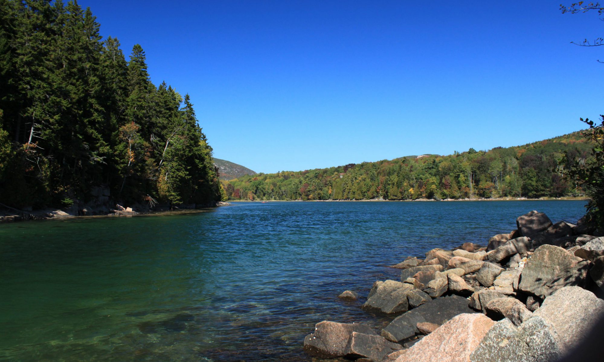
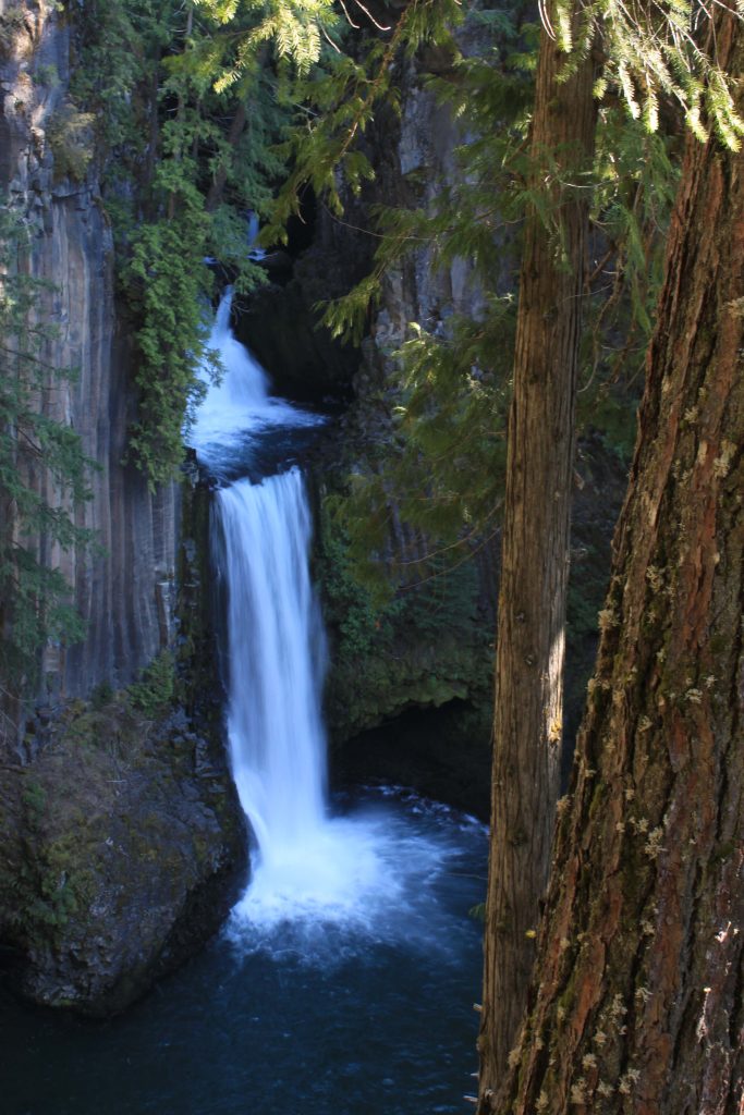
While I am waiting for the order to show up in the mail, there was an open sew yesterday with my guild that I had signed up to go to. I decided to break out two of the other quilts I was planning and get some work done on them. The Oregon waterfall quilt was one, and the “Hus Ved Havet” quilt was the other. Let’s talk a little about the Oregon waterfall quilt. As a reminder, this is the image:
The plan was to use the puzzle piece method that I’ve had iffy success with – the same method I used for the Tracy Arm quilt, only without actually printing the image out on fabric. The challenge for this version is that there is no sky, and I have not used the puzzle piece method on an image – real or imagined – without a sky.
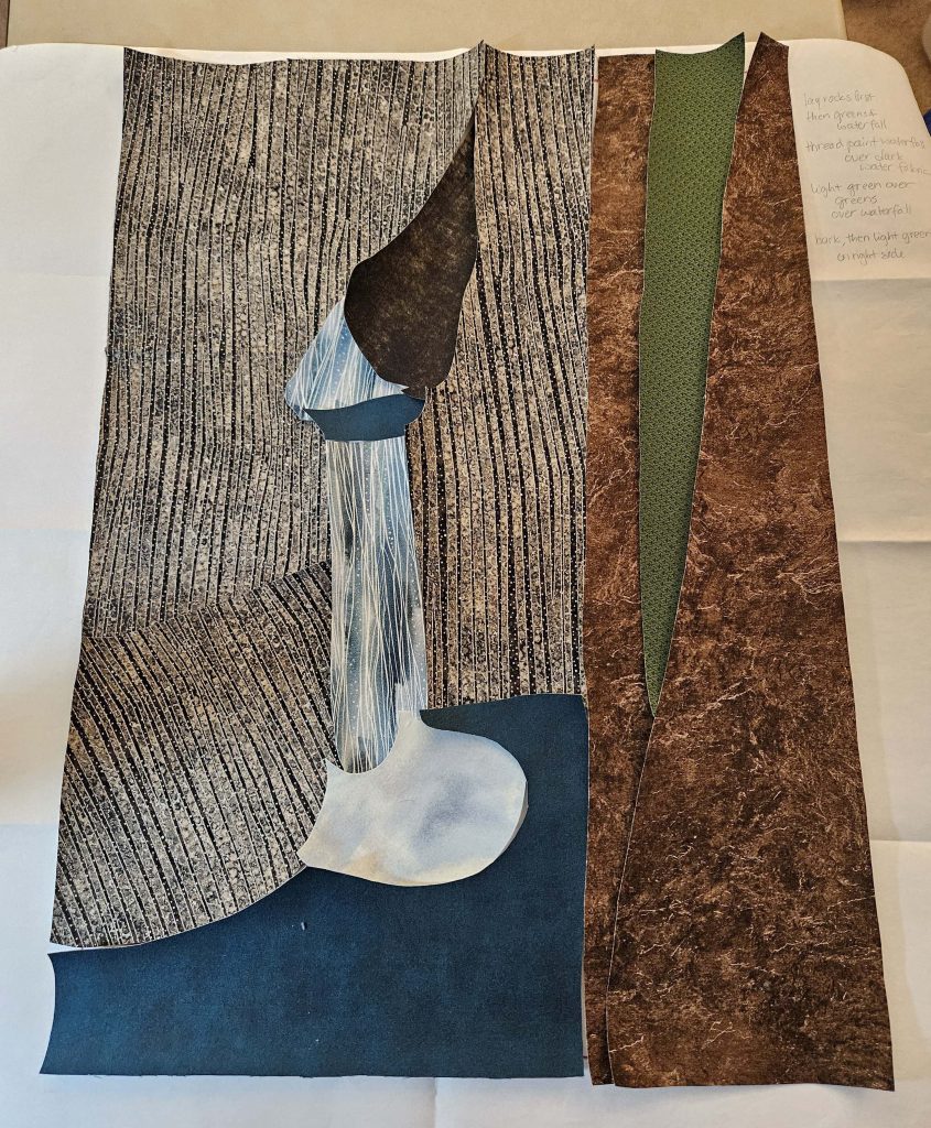
Previously, I had projected the image onto my design wall and drawn the rough outline of the image onto a piece of paper, making the template for the image. I also had all of the fabrics (except for, as it turns out, one that I conjured up out of my stash today). The next step was making the templates for the fusible.
This is not a terribly difficult quilt. With the work I did yesterday at open sew making the templates and getting them onto the fusible, I could have finished the layering of the puzzle pieces tonight if I had had any energy left over from my very busy weekend. But no, there was no energy left, so I got as far as ironing the fusible onto the fabrics and cutting out the puzzle pieces. The rest of it will have to wait until tomorrow, when I will be keeping my hands busy during the Executive Committee meeting (on Zoom) that I have to attend. So this is where I stopped today.
This is a good start! There’s obviously a ton of stuff missing – there needs to be more trees, and I might need to fill in some details – but I can actually see the image, and I like the fabric choices I made.
With chorus on pause over the holidays and the gym closed for renovations until the day after Christmas, I have no reason to leave the house for the next five days (except perhaps to go to the mailbox to fetch a jelly roll). To some people this might sound like hell, but I am in heaven! It’s cold, and I’m lazy. Let’s see what I manage to finish over the next week or so…
Also stay tuned for the “Hus Ved Havet” quilt update – I had a chance to work on that yesterday, too, and I’m excited!
That fabric that I substituted in – yeah, I didn’t have enough of that. I don’t have enough of that. So I have gotten this far, which you’ll notice isn’t a heck of a lot further than last time I posted.
And so the hunt begins. I know little about the fabric other than that it came from a jelly roll of Kona solids, so I am off to see the wizard to find Kona solids, hoping that when I do find them, this particular color will be among them. I need one 2” strip. If all else fails, I do have the information about the jelly roll and can buy another one of those, but I’m hoping to avoid doing that ‘cause, well, I really only need that one 2” strip. I have plenty of the other fabrics I’m using.
This, my friends, is where the fly-by-the-seat-of-my-pants nature of my quilting habits bites me in the ass. I really need to learn to write stuff down.
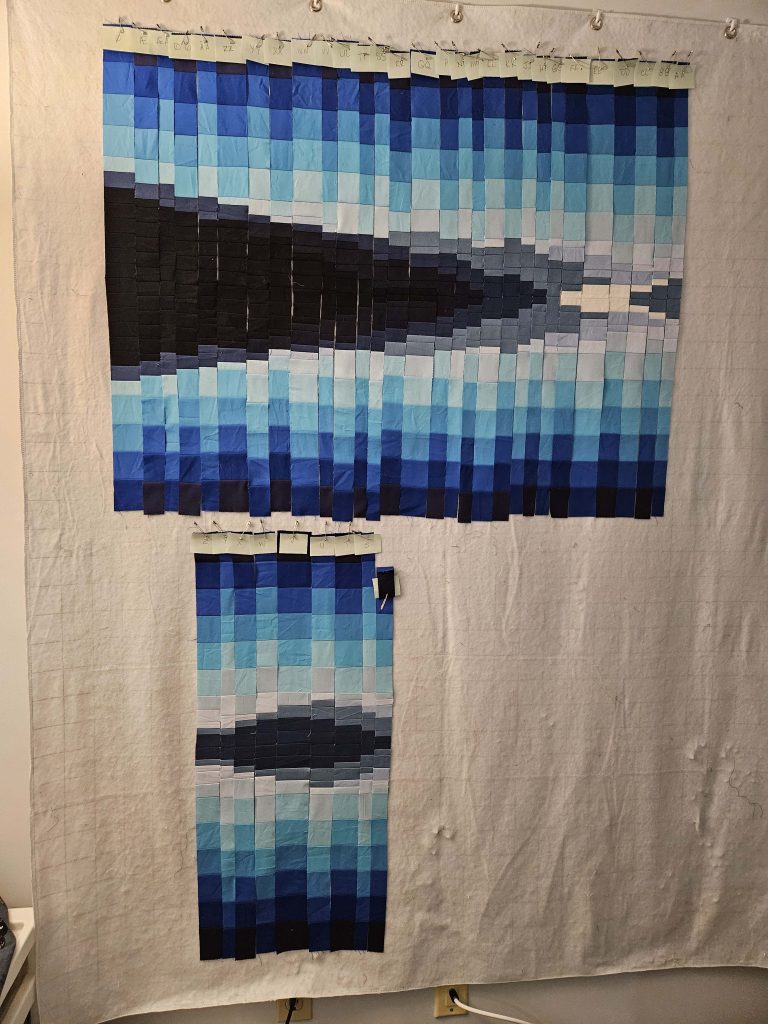
In between loads of laundry today, I was able to get to the halfway point of the College Fjord quilt. And now I’m at a bit of a standstill.
Some notes on what has changed since the last picture:
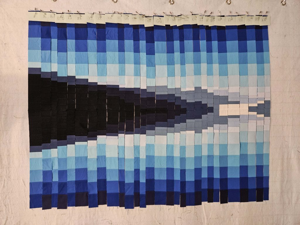
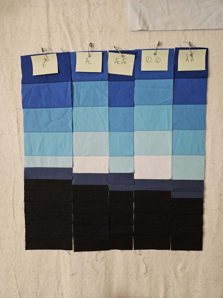
I switched out one of the blues. In this image, in the seventh column from the left, it’s the light sky blue just above the darker mountain blue. The color that was originally there was a slightly lighter sky blue – that color is now the next sky blue down. It was a pain in the ass to switch it out, but I like this one much better.
I decided that it didn’t make a difference that some of the lightest sky blues are nearly indistinguishable from the lightest mountain blues. There is definitely a difference if you look closely, but when you look at the overall image, they sort of blend together. And you know, what? The mountains in the original image sort of blend into the sky, too. So I’m not going to sweat it.
The columns starting with KK (you can see the Post-It notes with the column label at the top), going to the right, were done with a slightly different, much faster process than the ones before them. And interestingly enough, they are getting to be more consistent in size, so there are fewer seams that don’t line up, at least right now. It will be interesting to see if that holds when I begin sewing the columns together.
This is 29 columns. There are 54 total, so I’ve completed just over half of them. Top to bottom is 32”; that is the finished size (unless I decide to remain true to the image and cut 2” off of the bottom). The finished quilt will be 54” wide – currently, this is just under 40” wide with the columns laid out side-to-side like this. Each of these columns will lose half an inch when sewn together – seam allowances are a thing, after all. The narrowest columns are currently 1”. So when you’re looking at this image, keep in mind that when these 29 columns are sewn together, the piece will be 14” narrower than it is now.
Once I got to this point, I stared at it on my design wall for a long time. I had actually started running out of space on the design wall and had to move it up to the top so that I can fit the remaining part of the image below it.
I’m still debating how I’m going to build this quilt. Is it going to be a quilt-as-you-go kind of thing, or should I build the entire top and then attempt to quilt it? I briefly debated starting to sew the columns together today, which I cannot do if I want to quilt-as-I-go. I’m having trouble imagining the columns squished together, so I debated trying it out to see what it would look like. I’m desperately suppressing the urge to sew the columns together. I want to see what it’s going to look like in the end! But until I figure out how I want to build it, and especially quilt it, I don’t want to take any steps that would require even more use of the seam ripper.
Part of my hesitation is that I’m still making design decisions. I switched out a whole color and replaced it with a new one – TODAY. I’m still not sure if I’m happy with those white blocks on what is now the right side (will be the middle eventually). I can’t even start to quilt-as-I-go if there’s any chance that I might want to change things up later. And I can’t guarantee that I won’t change anything. I’m just not at that point.
I’m also still debating snow. Part of me likes it the way it is. Part of me want to put in snow. But if I do put in snow – do I follow the contours of the image? Or do I put snow in squared-off lines? The latter would be awful, but the former might ruin the bargello format (which arguably is holding on by a thread anyway).
Still planning on a water line. Still hanging on to mother-of-pearl buttons for the clouds. Need to find a pale yellow or two for the sun at some point. But things are moving along.
…do you know where your seam ripper is? I do. My seam ripper and I are by now rather good friends. Math has never been a strong skill of mine. Add in seam allowances, and whoo boy. We’re all in for a rocky ride.
I’m beginning to remember why I said I’d never do another bargello quilt after the last (and only) one I did. Check that – I’ve always remembered why. I just also live with that unbridled optimism that says, “That was YEARS ago! Maybe you’ll be better at it this time!” If I could roll my eyes at my former self, I would.
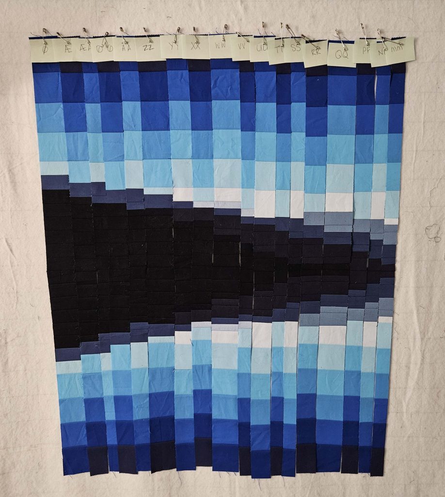
Having said that, I am too far into the College Fjord quilt to give up on it now. And I really do like it – from a distance, as long as I don’t look too closely at the seams that don’t look like they’ll match up when they’re sewn together. Here it is, in its current state:
It really does resemble the photo! And I do think I’ll be able to use some of the wonkiness of the seams, especially those in the sky blues below the water line. I’ve always known – based on that bargello I did years ago – that there would be seams that didn’t line up. My plan right now is to make the ones above the water line align as much as I possibly can, but to let them be wonky below the water line.
Here’s why: reflections, even in mirror-like water, are never truly a mirror. If you look at the original image, there are bits of ice in the water, and there are lines where some breath of wind slid across that bit of surface, causing a tiny ripple. I was trying to figure out how to get that across in the quilt. Wonky seams actually create that illusion nicely, much to my surprise!
I’m getting to the center part of the quilt, where I might have to fudge a sky blue or two here and there, so we’ll see how that goes. The blues I have are just enough, and so far, I have gotten away with not using one of the very lightest sky blues I have. I’m hoping not to use it at all – I think it’s too close to the one next to it – but I suspect I might have to pull it out in a couple of places. But that is a project for another day…maybe over the upcoming holiday weekend?
At this point in time, I think I have enough of a proof of concept that the bargello construction works for this kind of image, so I may begin to source fabrics for the “Hus Ved Havet” quilt. More on that to come!
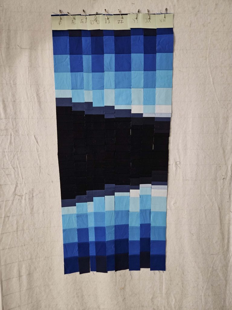
Over this past weekend, I had a full day to spend in the sewing room, so I started out working on a very overdue gift, but then had some time left over. I started sewing more of the double-wide strips, and I took out some of the lighter sky blues and replaced them with darker sky blues. Again, mistakes were made, decisions were reversed, math was done incorrectly, and the seam ripper got a workout.
After sewing four more of the double-wide strips, I decided I needed to see how they looked cut in half and mirrored. Ignoring the fact that there are regularly things that don’t line up (‘cause I’m me), I’m actually really pleased with how this looks so far.
I feel like it’s actually starting to look like some mountains with a beautifully clear sky above, reflected in some very clear water. Which, frankly, is what the original picture is. There’s a lot more to the picture, though.
While I am happy that it’s starting to look like it’s supposed to, there are still some things that need to get resolved:
The current plan is to do quilt-as-you-go quilting on this, with the strips being sewn together at the same time that they’re being sewn to the batting and backing. But I may have to throw that out, depending on what my solutions to these other issues are.
What, exactly, will I do for a water line? I was going to completely ignore it, but the more I look at this, the more I think that it needs to be there. There is, in fact, a clear water line in the original image. SO…white or blue? How will it be created? (Current thinking on that is embroidery floss, but I’m still contemplating.)
Same thoughts, only for snow. There is snow on top of almost all of the mountains. I would like to add that in somehow. The jury is completely out on that one…no idea how that’s going to go off, especially with the quilt-as-you-go method.
Look closely at the rightmost two strips in the picture. The lightest mountain blue – which is the second-lightest of all of the mountain blues – almost disappears against the sky blues. If my solution for the snow does not solve that issue, I’m going to have to figure out how to set those off so that the lightest mountains don’t just blend into the lightest sky colors. Although…if you look at the original image, the furthest mountains do just sort of blend into the sky. Again, not quite sure what I’m going to do about that.
I have some work ahead of me – design choices as well as a LOT of sewing. I did cut and sort the remaining mountain blue pieces – I have 45 little piles of mountain blue strips pinned and labeled with the column letter, ready to go. I may try to get some of them sewn tonight, in fact.
I’ve completed nine of 54 strips. As my friend Joe said when I was telling him about it, “You’re almost 20% done!” Dude, that did not help.
I found sky blues. Seven of them, to be exact. A new-to-me quilt store in Rhode Island had a whole wall of solids, and I was able to come up with the blues I needed. They have all been washed and cut, and I have sewn all of the sky blue strips together. I actually really like the shading of the seven sky blues in order. I would have liked to have more subtle transitions from one fabric to the next, but barring my ability to find an appropriate blue ombre (no one seems to think this exists), I’m going to have to claim artistic license here.
The sky blues, once I found them, were easy. They go in the same order every time, so I was able to just sew them together in strips. (Strip piecing FTW!) It’s those mountain blues that are going to be the death of me. I sewed five of them together. It took me a whole evening. Granted, mistakes were made, and the seam ripper got a workout. But the picture below shows one evening’s worth of work.
(I swear the darks are really blue and not black!)
Five down, fifty left to go!
The pieces you see are double wide – I have not yet cut them in half to produce the mirror image that goes below the waterline. So this is not what the final thing will look like. But it is definitely an approximation.
I am not 100% sure I’m happy with it yet. I feel like I need darker sky blues (which I do have), and I feel like it’ll look very different once I cut these pieces in half. I need some time (maybe this weekend?) when I can devote a day to just working on this and fiddling with it while I keep track of what works and what doesn’t.
One thing I am rather pleased with is the clear difference between the mountain blues and the sky blues. I was worried that there wouldn’t be a clear difference, but I absolutely see it. I think it also helps that the sky blues are two-inch blocks while the mountain blues are one-inch blocks. I think the contrast between the size and the color is very clear, at least here, with these blues. My opinion may change once I get into the center of the image, where the blues are lighter and it will be harder to tell them apart when they’re next to each other. But that is a long time away. I’ll get there eventually, but at the rate I’m going, it’ll be well into next year.
One of these days, my life will calm down, I’ll get my weekends back, and I’ll have time to really dig into this and get into a rhythm to get a lot done. One of these days…
So…once I find all of those blues, I actually have to DO SOMETHING with them. Remember: this is a bargello project. I’m still firmly convinced of that, even after I had to make a spreadsheet. A spreadsheet, folks. I must be off my rocker.
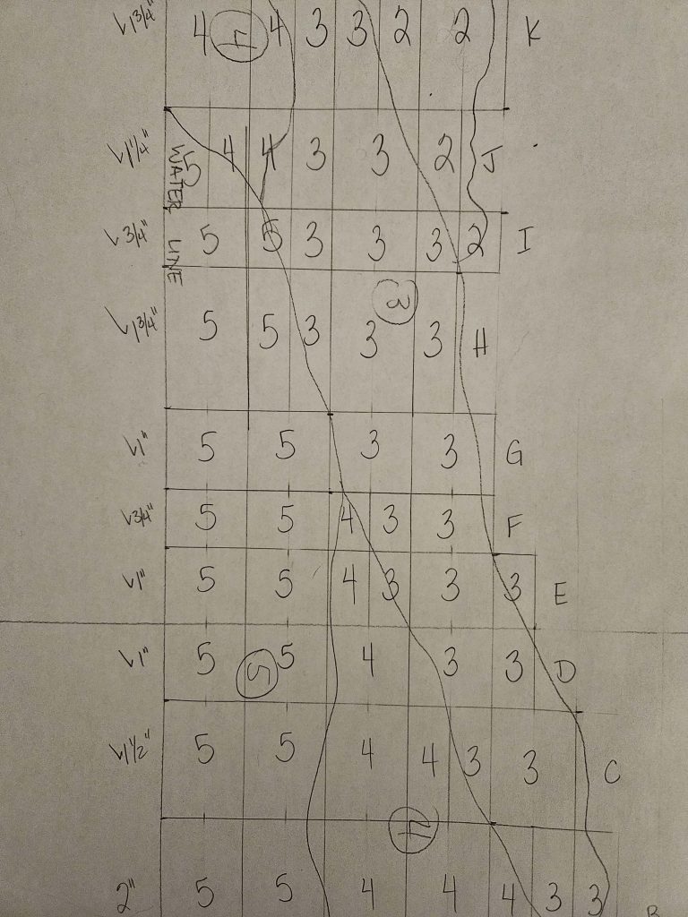
The first thing I did for this quilt was project the image on a wall where I’d taped a large piece of paper. I used the image to draw a rough outline of the shapes I wanted to mimic in the final quilt. The image on paper is 30” high and about 54” wide, so that is what the final quilt will be as well.
A couple of weeks ago, I sat down with a ruler and laid out horizontal lines an inch apart from the water line to the top of the mountains in the image. The water line is 16” from the top of the image, so the image is slightly top-heavy – more of the image depicts above the water line than below it – but the water is basically a mirror, so what I do on the top of the image will be mirrored below the water line. The mountains aren’t really a large part of the image – I think the largest mountains in the image only extend 6-7” above the water line. The rest is sky.
The sky will be fairly “standard” – it will be like a traditional bargello in that it will be the same colors, in the same order, simply staggered to create the appearance of movement. (Remember that I have mother-of-pearl buttons to create the clouds in the sky, so much of the sky will be covered by “clouds.”)
In a traditional bargello quilt, the height of the blocks is usually standardized – 1” finished, in most cases, but sometimes 2” finished. The width, however, varies depending on the effect that the pattern needs to create – a steeper angle needs pieces with smaller widths, while flatter curves can use wider pieces.
To create the mountains for this quilt, I squared off the contours of the mountains into 1”, or sometimes ½”, pieces, and varied the widths according to the changes in the coloring. I’d already assigned the six muted blues – I think I’ll call them mountain blues – to parts of the traced image, so all I had to do was number each of the squared-off pieces with the number of the mountain blue that it covered. I ended up with 54 columns of widths varying from ½” to 2”.
Here’s where it gets complicated. In a traditional bargello, the colors stay the same and appear in the same order. In this one, not a single one of the 54 columns is going to be the same as any other (except its mirror image below the water line). And therein lies the challenge…and the spreadsheet.
I labeled each column with a letter. And when I ran out of letters, I doubled them (AA, BB, etc.). And when I ran out of those (I didn’t use I, II, O, and OO for somewhat obvious reasons), I used the three extra letters in the alphabet of another language I speak, and doubled those as well. (Fortunately, I ran out of columns about the same time I ran out of letters and didn’t have to resort to Cyrillic.) I put each of those into a spreadsheet. I wrote down the width of the column, added a seam allowance, and doubled it (for its mirror image below the water line), and then I wrote down the number of 1” and ½” strips of each color that I would need. The spreadsheet is detailed. I am a dork, but I am an organized dork, at least on paper.
This is what the paper drawing looks like with all of my scribbling on it.
In the image, the water line is the straight line on the left, and the squiggly lines are the original tracing of the actual image. The rectangles with numbers in them will be pieces in the quilt; the numbers represent the blues – the higher the number, the darker the blue. The open space to the right is sky.
I hope it still makes sense to me when I sit down to actually sew the dang thing together.
The College Fjord quilt is going to be the most difficult quilt I have attempted so far. I made a SPREADSHEET. It’s ugly.
Let’s discuss, for the moment, the fact that I still cannot find the solid blues I want and that the indecision surrounding said blues has (temporarily, I hope) paralyzed forward momentum on this project for my ADHD brain. (Also, let’s ignore the fact that I have had a metric crap-ton of other things on my plate for the last few weeks, and I have not really been able do sit down and do anything in the sewing room beyond finishing a couple of bindings and watching old episodes of “All Things Great and Small.” (So excited about the new season in January! But I digress…)
I actually shouldn’t say that I haven’t found the blues I need for this project. I have found the blues for the mountains. Six of them. Muted blues, ranging from so-dark-it’s-almost-black to so-light-it’s-almost-white. Found them in one store actually – it was pretty perfect.
My issue has been finding solid sky blues. Bright blues. None of this muted nonsense. The morning sky (and the sky in this photo) is a brilliant, sapphire blue ranging from deep royal blue to, again, a blue that’s almost white, but a different almost-white than the muted blue almost-white. I can hear you now – “A blue that’s almost white is a blue that’s almost white. You can’t have different shades of it.” I (and the people who make paint chips you can get at the hardware store) beg to differ. Trust me, there is a difference.
A few weeks ago, I found a jelly roll of Kona solid blues and thought I’d died and gone to heaven. It looked perfect in the roll, inside its plastic, in the store. I got it home and unrolled it and…it was no longer perfect. Some of the colors stuck out like sore thumbs. There were 12 different shades of blue. I put them up on the design wall and picked out a couple of them as being wrong. I’ve been staring at them for weeks, and I can’t decide whether I need another roll or two (one roll doesn’t have enough for my project), or if I should just start over from scratch. And I also can’t decide whether I should use the 2.5” strips as is or cut them down to 1.5” strips for a true bargello (and a better blend from light to dark). At it’s longest, the sky needs to be 13.5” – with 2” (finished) strips, I only need 7 blues, but with 1” (finished) strips, I need double that, which means finding even more blues.
See why there’s a ton of indecision paralysis? I feel like I need to decide how many blues I actually need before I can go out and find them, and at the same time, I feel like I need to see how many blues I can find before I make a decision about how many of them I need. I don’t want to decide I absolutely MUST have 14 blues, only to find that I can only actually locate ten of them.
I finished the last of the binding on the Horseshoe Canyon quilt while I was on vacation a couple of weeks ago (finally catching up on the blog), and I’m really happy with it.
The binding wasn’t quite done when this picture was taken, but it was close enough.
It’s rare for me to think that a border fully completes the quilt, but in this case, I totally believe it. I wasn’t entirely sure I liked the quilt before I put the border on it, to be honest. Once I put the border on, it felt…right for the first time.
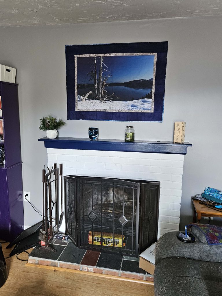
While I was at it, I hung the Crater Lake quilt over the fireplace for the first time as well. Here’s that update:
I think I started that quilt almost two years ago, and it’s finally up over the mantle. I’m glad it’s done, and I think it looks exactly like I was intending for it to look. That’s pretty rare in my house.
I’ve also been working on the College Fjord bargello, but it is slow going and I am still trying to find solid blue fabrics, so an update on that will have to wait.