Making More Decisions

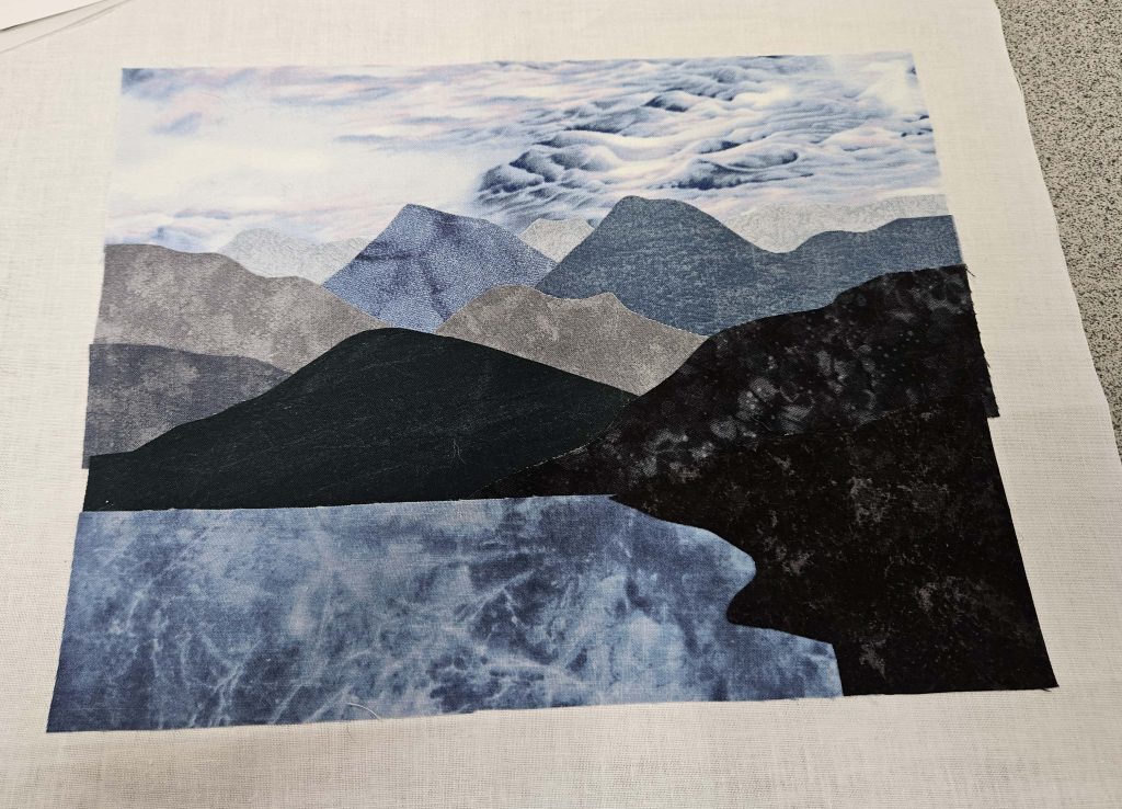
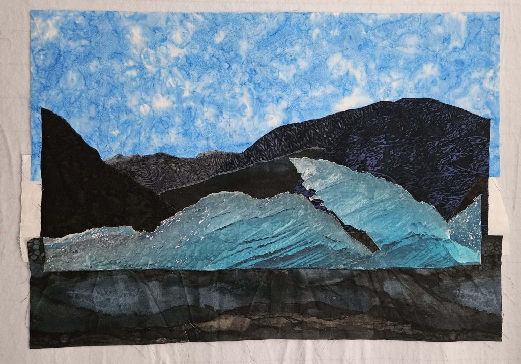
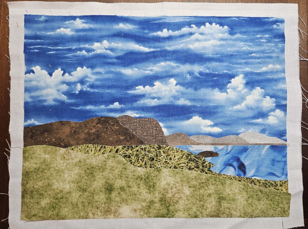
My guild has a Wednesday night Zoom meeting each week, just to hang out and work on whatever project we’re working on. I decided that I’d see if I could get more done on the Tracy Arm iceberg quilt. I ended up going to the quilt store beforehand to find the border/binding fabric. I took the quilt with me to get the border fabric (as one does), and I noticed that some of the iron-on adhesive had come unstuck, so I decided that I would need to sew things down. While I was there, I got some monofilament thread to sew down the iceberg.

So I spent the Zoom call sewing the fabric pieces down. Because I am remarkably consistent in my choices of colors for things in general, I already had all of the regular thread I needed to be able to sew all of the pieces other than the iceberg. The colors weren’t exact for all of the fabrics/threads, but they were close enough that the difference simply adds dimension rather than blending in seamlessly. I actually really like the sewing – it brings out some things that hadn’t been clear before.

Sewing with the monofilament on the iceberg was a challenge. I used regular thread in the bobbin, which may have been a mistake. Some of the stitching was perfect – it did exactly what I wanted it to do, and it’s invisible unless you look up close. But then there were occasional sections where the tension decided to go wonky, so the bobbin thread shows on top. I’m not quite sure what happened there, but I may need to make a bobbin of the monofilament thread just to finish it up. I gave up before I got to that point. I pulled out and sewed over one particularly long stretch where the bobbin thread was on top, and the same thing happened the second time I sewed over it, so I threw in the towel because I was frustrated and it was getting late. But I’ll go back at it at some point soon.

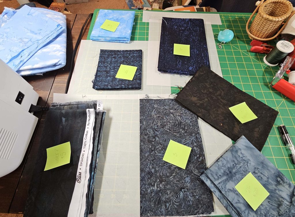
The fabrics for the borders – both the green for the inner border that you see in the picture I posted in the last blog entry and the darker blue I got for the outer border – went into the laundry when I got home from the quilt store, so I’ll tackle the border some other day. I do wash all of my fabrics before I do anything with them. I work with reds occasionally, and I have screwed up a quilt because the red ran in the laundry (even after I washed it!), so I do try to get everything laundered before I use it. It doesn’t really make a difference what you do – you just have to be consistent at it. 

One more decision that I’m going to have to make: the quilt top is stiff in places because of the iron-on adhesive. But the iron-on adhesive is not all over the top of the quilt, so some places are just…fabric, while other places are layers of fabric with the iron-on adhesive. If I’m just going to hang the quilt on the wall, that’s not a big deal – no one will feel it regularly and realize that it’s different. But if I plan on doing something else with it, I might need to figure out how to make the feel of the entire top consistent. My inclination is that I’ll simply hang the quilt on the wall so it’s not a big deal, but I do have to make sure that decision is the right one before I sandwich the quilt.

When the Weather is Bad…

…spend the day in the sewing room. However, I did not get done what I had planned.

I thought today would be the day I projected the abstract iceberg image up on the wall and figured out what fabrics would go in which spaces. I was completely wrong. Instead, I worked on the Tracy Arm quilt. In fact, I finished the image part of it, which was a bit of a surprise.

I used a modification of a technique that I learned in a class in April taught by Trudy, one of the members of my quilt guild. I don’t think it’s Trudy’s original technique – if I remember correctly, she learned it from someone else. But she has done a lot with it, mostly with landscape templates that she has made up. I made this piece in her class the day she taught it to us.

The technique involves cutting out what are essentially puzzle pieces and adhering them to a piece of muslin using an iron-on adhesive. The selection of fabrics is crucial, and there’s a method to it. I used the same technique on the unsuccessful Norway image in the Choosing Pictures, Part II blog entry. The technique is fairly simple – an image can easily be done in a few hours – but a lot of thinking goes into it. That’s the technique I wanted to use for the Tracy Arm iceberg quilt.

As you remember from the previous blog entry, I had most of the fabrics for this, but I wasn’t entirely sure that the sky fabric was the one I was going to use. Well, I used that sky fabric – it turns out that once I laid it out with all of the other fabrics, it was perfect.

All of the fabrics with Post-Its are part of the Tracy Arm quilt

The plan was to recreate the entire image except for that awesomely fabulous iceberg right in the middle. I had the image printed onto fabric, and I planned to use that as a template – much like Trudy’s templates – get the fabric pieces to be the right size. I also planned to cut the iceberg out of the original image and basically paste it as the focal point – rightly so – of the recreated image. 

The challenge for this particular image was that it was much larger than a sheet of tracing paper, which is necessary to get the mirror image pieces you need of both the fabric and the adhesive. Rather than attempting to draw the full image out on one sheet of paper, I ended up tracing individual pieces of the image onto paper. Fortunately, I only needed to extend the paper for one piece, and I had some smaller pieces I’d cut off of the foundation papers for the abstract iceberg quilt yesterday.

One of these days, I’ll learn that I need to go back and look at the instructions for a technique like this if I haven’t done it in a while. I completely forgot about the whole mirror image part of creating the templates, so I had to redo some stuff about halfway through. But most of the fabrics were batiks, which are thankfully reversible, so I was able to get away with screwing up…this time.

I also didn’t have a piece of muslin that was big enough to act as a foundation for all of the pieces, so I improvised. I ended up using the sky piece and the water piece as foundations for some of the pieces, so I simply had to find a foundation for the middle 3.25” of the image. The printed image had about 8” of white border around it, and once I cut it off, I was able to use one of those pieces as the foundation for the middle of the image. It took math. I am not good at math. But somehow it worked. 

Since I was using a piece of the original image in the recreated image, the scale of the recreated image had to match the original as closely as possible. Where I and my ADHD might have just fudged it for an image that was entirely a recreation, I really didn’t want to get to the end and find out that the iceberg was bigger or smaller than the space that it needed to go in. So I measured, and I marked things with chalk to show where they should go. And the iceberg fit PERFECTLY in the end. I was rather proud of myself, honestly. I was so scared of getting to the end and discovering I screwed up somehow that I really took my time to get it right.

I’m really pleased with how it came out. The iceberg is, as it should be, the absolute centerpiece of this quilt.

There are still some decisions that need to be made. In the original image, there is snow on some of the mountains in the background, which I pretty much ignored when I was choosing fabrics figuring that I could add it later if I felt I needed to. I haven’t decided yet whether or not to do so, and if I did add it in, how I would do it. (More fabric? Thread painting? Paint? Something else?) I also have not yet decided whether or not I want to sew down the applique in some way. I feel like I probably should, but I am not sure how to deal with the iceberg, which has little fiddly bits I had to cut out that would be lost if sewed over them. So. many. decisions.

And Sometimes, the Serendipitous Happens…

So today, I went looking for more fabrics for the Tracy Arm iceberg quilt and the abstract iceberg quilt. I needed water and sky for the Tracy Arm one, and I just wanted to see if I could find more of the silvers/whites/ice blue-greens for the abstract one. I went to quilt store where I worked part-time a number of years ago. It’s not too far from home, and I had a feeling I might be able to find some good stuff. I was able to round out the collection of fabrics for the abstract quilt, and I found a good water fabric for the Tracy Arm quilt. I did get a fabric for the sky, but the jury’s still out on whether or not I’ll actually use it.

But that was not the headlining story of the day. I think I mentioned when I posted about the Horseshoe Canyon quilt that I randomly found the pattern that I ended up using for it one day while I was sourcing fabrics for it. I don’t go into a project with a pattern in mind. For the abstract iceberg quilt, I was trying to find fabrics for it in hopes that I might one day be able to see a way to put those fabrics together, but I didn’t yet have a good picture in my head about what that was going to look like. Today, I found an awesome pattern for it!

The abstract iceberg quilt, to me, is very vertical, even though the image itself is in landscape orientation. The lines of the iceberg are up and down, not side to side, and while they’re not totally parallel, there’s a certain interval to them. When I imagined putting together that quilt, I thought about putting together tall vertical triangles – like really skinny Christmas trees. Some of them might have been upside down, but that’s the image I had in my head. I just didn’t know how to vary the colors within those larger triangles.

The Aura quilt pattern by Alison Glass caught my eye in the shop today. It was exactly what I was looking for. And I literally spent the rest of my day figuring out how I was going to adapt that (portrait orientation) pattern to the (landscape orientation) photograph.

So here’s the current plan: the pattern calls for a series of 8”w x 10”h blocks that are foundation paper pieced in A and B halves. I will make a quilt that will end up being 48”w X 30”h (so 6 blocks wide and 3 blocks high). The idea is to project the image (using a friend’s projector) onto my design wall at those exact dimensions and line each of the papers up with the part of the image that it will cover. Once the paper is lined up properly, I’ll choose a color – white, silver, dark gray, ice blue-green – for that piece of fabric based on the main color that’s in that piece on the image. Then I’ll be able to count up the number of pieces for each color and cut as necessary.

In theory, this will work. I was able to project the image at those dimensions on my wall, and I have all of the foundation papers copied and labeled. I have a mapped diagram of the blocks together (the pattern included a coloring diagram, which was helpful), so now all I need to do is put it all together and label the foundation papers.

I am still looking for fabrics, though. I have four ice blue-greens, four light gray/silvers, and a dark gray for the water at the bottom of the image. I want to get one or two white-on-white fabrics because I do think those will come in handy for a few spots. And I need a black for the sediment streak on the right side of the image, but I might be able to find something useful for that in my existing stash – I don’t need a ton of it.

I was supposed to go kayaking with a friend tomorrow, but the weather forecast is calling for thunderstorms most of the afternoon, so we called it off and will try again in a couple of weeks. I guess I’ll just have to stay home and work on this. Darn!

Fabric Challenges

A few blog posts ago, I mentioned that I’ve had to get over my dislike of batiks. Let’s look at that a little.

Batiks are…not my style. Generally, at least. Up to this point in my quilting journey, I have used them very little. I tend to use bright colors and crisp patterns that appeal to me, and batiks always seem to be…I don’t know. Sloppy is a word I might use, but it has negative connotations that I don’t mean. Irregular might be a better word. Out of focus, to use a term from photography. The lines aren’t sharp – they tend to blend a little more than I’d like. Put batiks next to the clearly defined patterns that I normally choose, and they seem out of place. Like a watercolor painting contrasted with a nice sharp photograph. Each has their place, but you probably aren’t going to mix them into the same piece of art. Up until recently, I’ve tended to gravitate towards the photographs rather than the watercolors. Which, you know, makes sense…since I’m a photographer.

But the very qualities that make batiks ill-suited to fit with the fabrics I normally choose are exactly what makes them excellent for these projects. Nature is irregular and amorphous and…sloppy. Nature doesn’t fit neatly into a box. Batiks are perfect for attempting to recreate nature through fabric. (Which is sort of ironic – using the fabric version of watercolors to recreate photographs…but I digress.)

With some exceptions, batik fabrics read as solid – or, at the very least, variations on one color – from across a room. But there is random texture to them that mimics nature nicely, in a way that a perfectly designed, repeatable pattern can’t ever do. And so I have been going directly to the batiks to source many of the fabrics for these quilts. And that is a sentence I never thought I’d write.

That’s not to say that I have not – and won’t in the future – use fabrics elsewhere in the store for some of these quilts. Several of the fabrics I’ve picked out for the abstract iceberg quilt came from, of all places, the section of Christmas fabrics. (Hey – if you’re looking for whites and grays with silver, the Christmas section is a great place to start. You certainly won’t find them in the Halloween fabrics!) The key here is keeping the photograph in mind, but not closing yourself off to the possibilities that might lie in sections of the quilt store you haven’t looked at yet. I almost stopped after looking through the batiks for fabrics for the abstract iceberg. I’m glad I didn’t.

One word of caution: when you are looking for fabric for a quilt, take everything with you that you think you might use in it. Everything. At least a small sample of each. (This is just a word to the wise for any quilt, but particularly so for these.) For the Horseshoe Canyon quilt, I bought several pieces of orange fabric that, in my mind’s eye, I was sure would be perfect to go with the oranges I already had. And in every case where I didn’t have samples of the fabric I already had, I was 100% wrong. Was my mind’s eye wrong? Was the lighting weird? Who knows? But now I have these pieces of orange batik fabric that I don’t know what to do with (because orange isn’t normally my style AT ALL, and we’ve already talked about my relationship with batiks). So…yeah. Take what you’ve already purchased with you when sourcing additional fabrics, or be prepared to put the extras into your stash ‘cause you screwed up.

Choosing Fabrics

If you’re not going to print the photograph onto fabric and play with it that way, you’re probably going to need to find some fabrics that in some way mimic what you’re trying to capture of the photo. Colors. Shapes. Mood. All of those can be recreated in some way using the fabrics you can find in a quilt store.

When I was looking at fabrics for the Horseshoe Canyon quilt, I was mostly trying to capture color, but I wasn’t necessarily trying to be 100% faithful to the original image. There was no way that anyone could have gotten me to produce a quilt where all of that orange was replaced by the rust colors in the original image. Nope. That’s not how I see that image in my mind’s eye, and I knew the rust colors of the canyon weren’t going to translate well into a quilt. In retrospect, would I have incorporated a few rusts here and there among all of those orange strips of fabric? Maybe. I don’t know what that might have looked like. But I might have entertained the thought, at least, instead of simply blazing ahead with all of those awfully bright oranges. I wanted the quilt to be saturated colors, not muted ones, and the orange truly came through for me in that respect. I also liked the combination of bright blue and orange with a deep, dark green, and in that sense the final quilt is a success.

Look back at the unsuccessful (read: BOOOORING) version of that image from Norway that made me rethink all of the ideas I had to create fabric versions of some of my favorite photos. For that attempt, I was trying much harder to be faithful to the original coloring of the image, and look where it got me. It got me a snoozefest. Granted, I don’t necessarily think choosing different colors might have worked better, but certainly going with the original coloring wasn’t as successful as I had thought it might be.

I’m currently choosing fabrics for two of the three quilts I’m working on. (The third is thread painting, so no extra fabrics until I add a border, and I won’t even think about border fabric until the inside image is complete.) For the Tracy Arm iceberg one, I’m trying as much as possible to maintain the feel of the original photograph, if not the exact original colors. The goal for that quilt is to emphasize the brilliant blue green of the iceberg, which the photo does nicely. But I have a chance to keep the feeling of the photo yet enhance the contrast between the rest of the image and the iceberg. I have selected some fabrics from my stash, but I’m also looking for others. And I’m debating what to do about the snow on the mountains in the original image. I’m just not going to find that in a fabric. So – do I leave it out? Do I insert it with thread (not fabric) at the end? Do I attempt to find a good snow fabric that might suffice in small quantities? I might try all three and see which one I like best.

For the abstract iceberg image, I’m mostly going for the colors. Those are what drew me to the photo when it was being displayed on the big screen on the ship, and I think that image might not be as good if it were just plain white ice, for example. The blue green of the ice is compelling to me (hence my wanting to do two different quilts with that color as the emphasis). The challenge here is going to be finding the right blue green, with enough variation and quantity that it will fill out the quilt nicely.

Printing Photos

Two of the quilts I’m working on involve images printed on fabric. There are two ways you can do this: either print the image out yourself on your home printer or get a service to do it for you. Both of these have worked for me at different times, so let’s talk about the pros and cons of each.

Printing at Home

If you want just one or two photos, and you don’t need them to be larger than a standard 8.5” x 11” piece of paper, print at home. A package of printable fabric will run you anywhere from $15-25 (USD, in 2024), and it will get you six pieces of fabric that you can run through your printer. Make sure you get the correct kind of fabric for your printer – it comes in laserjet and inkjet versions. Follow the instructions on the back of the package – they’re not usually terribly difficult. Last time I did it, I printed on the fabric, then peeled the fabric off of the plastic it was attached to (to make it stiff enough to go through the printer) and soaked the fabric in water to set the image. Once it was dry, I ironed it, and then I was ready to go. Your instructions may differ, though – read the ones for the fabric you’ve purchased, please!

Printing with a Service

You may find other companies that provide this service, but I use Spoonflower. Spoonflower’s printing services are usually used by designers who have designed some sort of pattern to go onto the fabric in a repeated way, but you can also just have them print one large image on a yard of fabric. The largest I’ve been able to get one of my photos is about 20”h x 30”w (for a landscape photo). The fabric is good quality, and the colors come out true to the original. I have been very pleased with the quality of the images I’ve printed. If you have a large number of small images to print, or if you want an image that is bigger than a standard piece of paper, use a service such as Spoonflower.

Don’t forget! You must get permission of the photographer (the copyright holder) if you did not take the photograph you want to use. You’ll note that I got Oscar’s permission to use his photograph even though I am not actually going to print the image onto fabric. Technically, I don’t need his permission to create the quilt – my quilt would be considered “fair use” of his image under copyright law because I am using no part of his original image in the quilt. (Also, because the image was sent to us in a logbook compiled by the cruise company with the instruction to “share with friends and family,” my use of the image in my previous blog post is allowed.) But as a photographer, I put myself in Oscar’s shoes. I would very much want to know if someone liked one of my photographs enough to use it as inspiration for another piece of art. So I asked. (I also told Oscar I would tag him on Instagram in an image of the quilt when it’s done so he can see how I used his image.) GET THE PHOTOGRAPHER’S BLESSING for whatever you want to do. It’s common courtesy, and it’s the law. 

Also don’t forget that you don’t have to print out the photo to use it as inspiration for a quilt! Use the colors, or the shapes, or both to capture the spirit of the image instead of the actual photograph itself. Of the three quilts I’m going to be working on, two involve printed photographs, but one doesn’t. Use your imagination!

What’s the Process?

When I was going through the process of building the Horseshoe Canyon quilt, I wasn’t quite sure what form this blog would take. So I documented a few things, but not nearly enough to walk anyone through the process of doing it for themselves. Now that I’ve got one quilt under my belt (mostly anyway), I’m going to start working on several new ones. As I work on them, I’ll document the steps I take so that someone else might be able to follow in my footsteps someday. So…what’s next?

I have three images I’m working on. Let me go through them one by one.

The first image I’m working on is a picture I took in the Lofoten Islands in Norway in the fall of 2023. This is the classic Reine (Hamnøy, really) rorbuer shot that every photographer wants to get. I got it home, and I removed all of the color in it except for the red of the fishermen’s cottages, which is classic Lofoten style. Then, I had it printed out on fabric. The idea, once I gather the gumption to tackle it, is that I will replace some of the color from the original image using thread. I’ve never done this before. I’m a little scared. This will take me a while to begin – I guarantee it.

This image is also printed out on fabric. I took this on a recent cruise in Alaska – Tracy Arm, in Tongass National Forest, to be specific. The icebergs in Tracy Arm, which come off of the South Sawyer Glacier, are sometimes this lovely shade of green-blue that I found rather impossible to resist as a photographer. I had the whole photograph printed out on fabric, but in reality I’m just going to use the iceberg part of the image. The rest of it I will recreate using regular fabrics I can find in the quilt store. This one I am really, truly excited about.

This is another one I’m excited about. This picture was taken by Oscar Farrera, the official ship photographer on the Alaska cruise I went on. I saw this picture on a screen on the ship and asked Oscar if I could use it as the inspiration for a quilt, and he agreed (although I’m pretty sure he thinks I’m nuts). This one is going to be more abstract – there’s no way I could do a faithful rendition of this using fabrics from the quilt store, so while I will indeed be using other fabrics, the idea is that I’ll use the colors and the shapes in the original image to inspire the end result. Unlike the Horseshoe Canyon quilt, though, I do not (yet?) have a pattern I’ll be following. In fact, I’m still not 100% sure how I plan to do any of this, but there’s nothing like figuring it out as I go along!

At this point, you – like Oscar – may be questioning my sanity. “Three pictures?” you ask. “Why three?” Excellent question. There are several reasons. 

  1. It’s going to take me some time to figure out the thread painting bit of the Lofoten quilt, so in the short term, I’ll really only be working on two quilts. But I do suspect I will start work on the Lofoten quilt before I finish at least one of the other two.
  2. It’s also going to take me a few weeks to find a critical mass of fabrics for the abstract iceberg quilt. I have several fabric stores I want to visit, and while a couple of them are in the area, a couple aren’t, and they are, unfortunately, in totally opposite directions from my house. In addition, most of the stores are open during my working hours on weekdays, so I have to go on weekends. It’ll probably take me a month or so to get to all of them. While I’m gathering fabrics, I’ll probably attempt to work out what exactly I’ll do to them once I find them, so there will be some planning behind the scenes that may or may not be documented.
  3. ADHD. I get bored easily. I found that while I was working on the Horseshoe Canyon quilt, I needed a distraction from it because I was really sick of sewing all of those orange strips together. Fortunately, I took a three-week break from working on that quilt right in the middle because I went on vacation, so I was able to take the time I needed and come back to it excited to work on it and, most of all, get it done. I do not have any vacations planned anytime soon, so I’m going to plan now to work on several things so I don’t get bored or frustrated and attempt to walk away from any of these projects permanently. When I’ve had enough of working on this one, I can work on this other one.

So, for those reasons, I’ve got three projects moving along at a slow but steady pace.

Horseshoe Canyon

This is my first attempt at a quilt based on a picture as part of this new project. The image I chose is from a 2019 visit to Arizona and the Grand Canyon. My friend Nicole and I took a day trip to Antelope Canyon and stopped at an overlook over Horseshoe Canyon on the way back. This is an example of a picture I like that didn’t have a particular focus element in it that would make it interesting printed out on fabric. It also wouldn’t have lent itself well to the applique method I learned, so I decided this would be an abstract version.

I like this photo because it has movement, and I think the colors go well together. When I was looking for the fabrics, though, I could not bring myself to use the rust color of the canyon itself. The blue of the sky and the dark green of the river – those are totally in my wheelhouse, and I was actually able to use some fabrics I already owned (always a bonus). But I am not a fan of brown, and I wanted the deep green of the river to pop out a little more than it did in the original photo. So I decided to use a brighter orange instead. I liked the combination of dark green, bright blue, and orange – somehow, they just fit together (in my head, at least).

I also found a published pattern called Leading Edge by Canuck Quilter Designs that mimicked the shape of the river as it flowed through the canyon in my image. I ended up changing the order of the rows in the design (as you’ll see), but basically keeping the structure of each row the same. Finding the published pattern that just happened to mimic the image that I was trying ro recreate was a fluke of nature. I’m still not quite sure how that happened as it did. I’m glad it did – I would not have known how to approach recreating that image without the pattern – but I also know that I’m not going to be able to do that with all – or perhaps even any – of my quilts going forward. But this was an excellent way to dip my toes into creating an abstract version of this image. And I’m pleased with the result.

I learned a lot in this process. I leaned into the orange perhaps a little harder than I should have, and in retrospect, I might have sprinkled some of the rust colors in between the orange stripes for variation. But I am unused to working with orange (give me a blue, green, purple, or even red any day of the week, but oranges, yellows, and browns tend not to find any sort of place in my work), so the end result – to my eyes, a wall of bright orange – sort of hit me in the face as I was putting it up on my design wall right at the very end. Could I have stopped and adding a few rust stripes in? Sure. Was I going to do so? Nope. (See my early posts on how it’s better done than perfect.) I chalked it up as a learning experience, and I’m moving on.

I do like the final result. It needs a border, and I haven’t figured out what that might be yet, and I am yet hoping that the border will bring it all together. Because of the orange stripes, there’s a ton of texture already in the quilt, so the quilting is likely to be stitch-in-the-ditch along some (not all) of the orange pieces, plus some texture in the greens and blues. I’ll post a picture when it’s all done, too.

Choosing Images, Part II

I had another photo from Norway that I was sure I could turn into a small fabric image using a type of layered applique technique I learned in a class taught by someone in my guild. The image is fairly simple – a road, some rocks in the foreground, and some mountains in the background. I easily found fabrics that mimicked the colors in the image, and I set out to recreate it. I love the photograph. The fabric version is BOOORING.

It turns out that the texture in the image was what made it interesting. Take away that specific texture and replace it with a generic texture, and the image loses its impact. So as I look through my pictures to see which ones might end up as cool quilts, I have a lot to think about.

Each of the three types of categories of quilts I can create needs a different quality of image. 

Interesting images that I would have no hope of recreating with fabric can go one of three ways:

  • Is there an interesting element to it? If yes, then I might print the image out on fabric. Unlike the Crater Lake quilt, though, I want to be able to do something interesting to it once it’s printed out. I don’t simply want an image printed on fabric with standard fabric borders. I’m currently waiting on two pictures that Spoonflower has printed to arrive in the mail. I have two very different ideas for what I’m going to do with those two pictures. But I knew that I would have no hope of recreating those two photos to my satisfaction without printing them out on fabric.
  • Are there layers to the image? If so, that might be a good candidate for the layered applique technique I learned earlier this year. I can tell right now, though, that there won’t be many of these. First, I’m not a huge fan of applique. Second, this technique is relatively easy to do, but as I illustrated above, it’s a very specific photograph that will withstand this treatment. I’m honestly not sure I have very many photos that will suffice.
  • Are there lots of colors, or is the image something I like but that would be boring using either of the methods above? If so, it might benefit from the abstract treatment. The first quilt I’ve worked on, in fact, is one of these, and I have another one in my head that I’ll start trying to find fabrics for soon.

I’m still looking through the images I have to find ones that I think would translate well to quilts. I’ve considered and rejected many images so far. I keep having to remind myself of what I am looking for when I look through my pictures. I look at the pictures one way when I’m trying to decide which ones I like in general, but I have to reframe how I look at them when I’m evaluating whether or not they’d make good quilts.

What Works and What Doesn’t (Mostly What Doesn’t)

When I started working in earnest on this project, I started with the images. With over 45,000 images on my hard drive, there’s a lot to sort through. I have my favorites – the images that I come back to again and again when I need a background for a business card or something to hang on my wall or an example of what my photography is like. I started with my favorite images, but I began to realize that my favorites weren’t necessarily going to translate well into quilts that build on the skills I have. Let me explain using an example.

One of my favorite images from Acadia is a night shot that I took in September 2014 from a pull-out on Park Loop Road. It was an accident – I was doing 30-second exposures of the Milky Way, and I had framed it with an evergreen tree in the foreground that was completely black, which made the Milky Way behind it stand out. One of the dangers of long exposures is that, in a camera’s world, 30 seconds is a LONG time. A lot can happen in 30 seconds, especially out in nature. A plane or a boat comes out of nowhere and now you’ve got a light trail across some otherwise dark piece of sky or water. Or, as in this case, a car drives by. I was trying to time my pictures such that I wouldn’t get the headlights or taillights from cars passing on Park Loop Road behind me. But…a lot can happen in 30 seconds.

In this case, I had the camera set to do a 30-second exposure. Once I pressed the shutter button, there was nothing I could do to close the shutter and end the shot. I waited until a car had passed behind me and, hearing no other cars coming, pressed the shutter button. About five seconds later, a car came around the bend, and its headlights shone onto the tree I was using to frame the sky. You know, that tree I wanted to be black. Oh well. So much for that shot. But the car didn’t just pass behind me and continue on its way. It passed me, then stopped and backed into the pull-out where I was standing. All of a sudden, during the 30-second exposure, I not only had white headlights shining on the tree from behind me to the left, but I also had bright red brake lights shining on the tree from behind me to my right. Let’s just say that it was a good thing that the camera wasn’t recording audio. I cursed up a storm. I was 100% sure that shot was a complete loss. So I kept going, and I did end up getting shots exactly like I wanted them – the Milky Way in the distance over the water, framed by completely black trees in the foreground. They’re nice images. They would be perfectly adequate…if I hadn’t gotten that one shot with the white and red lights on that tree.

This photo has become one of my favorites from that night. It’s an interesting image with a good story behind it, and it was a total accident. It was one of the first images I thought of when I started looking through my photos for quilt ideas. It’s also one of the first images I rejected. I’m pretty sure I didn’t even have to look at it to reject it. Someone who has a lot more patience than I do and is eager to work with little fiddly bits of fabric would have a field day with this image. I am not that person. The image is too detailed to really do well in quilt format, at least for me. If I had better thread painting skills and was interested in figuring out how to faithfully recreate stars and the nebulousness of the Milky Way, this would be an awesome quilt. Maybe someday, but I honestly wouldn’t hold my breath if I were you.